Owned product / Public beta
Product Direction / Digital Products / Brand Identity / Websites
Kaptly

Product Direction / Digital Products / Brand Identity / Websites
Scroll ↓An owned product, taken from operating problem to public beta.
Kaptly is an owned SaaS product for boutique service teams. The work covered product direction, workflow architecture, brand identity, UX/UI, documentation, and launch—bringing a recurring intake problem into a working public beta.
Project brief
Scope at a glanceDesign the product around the decisions that move an inquiry forward, not around the form itself.
- Role
- Founder, product designer & brand lead
- Responsibilities
- Product direction
- Workflow architecture
- UX/UI design
- Brand identity
- Launch website
- Constraint
- Turn a complex intake workflow into a useful first release without allowing the product to become a heavyweight CRM.
- Deliverables
- Product strategy
- Working public beta
- Visual identity
- Interface system
- Marketing website

Chapter
01
The Operating Problem
In detail
Collecting answers was not the same as moving work forward.
A standard inquiry form can gather a name, budget, and brief, then leave the team to interpret fit, request missing context, and decide who should respond. The submission arrives, but the decision system begins afterward.
Kaptly started with a narrower question: could intake adapt to the prospect, qualify the request, and trigger the right next step before the team entered a separate operational tool?
Chapter
02
The Product Thesis
Product boundary
Build the layer between first contact and kickoff.
Kaptly was deliberately positioned as intake infrastructure rather than an all-purpose CRM. The core promise became simple: capture the right context, qualify consistently, and move the request forward while preserving the studio’s own brand.
- Adapt the intake
- 01
- Qualify the request
- 02
- Move it forward
- 03
Chapter
03
Scope & Prioritization
Release logic
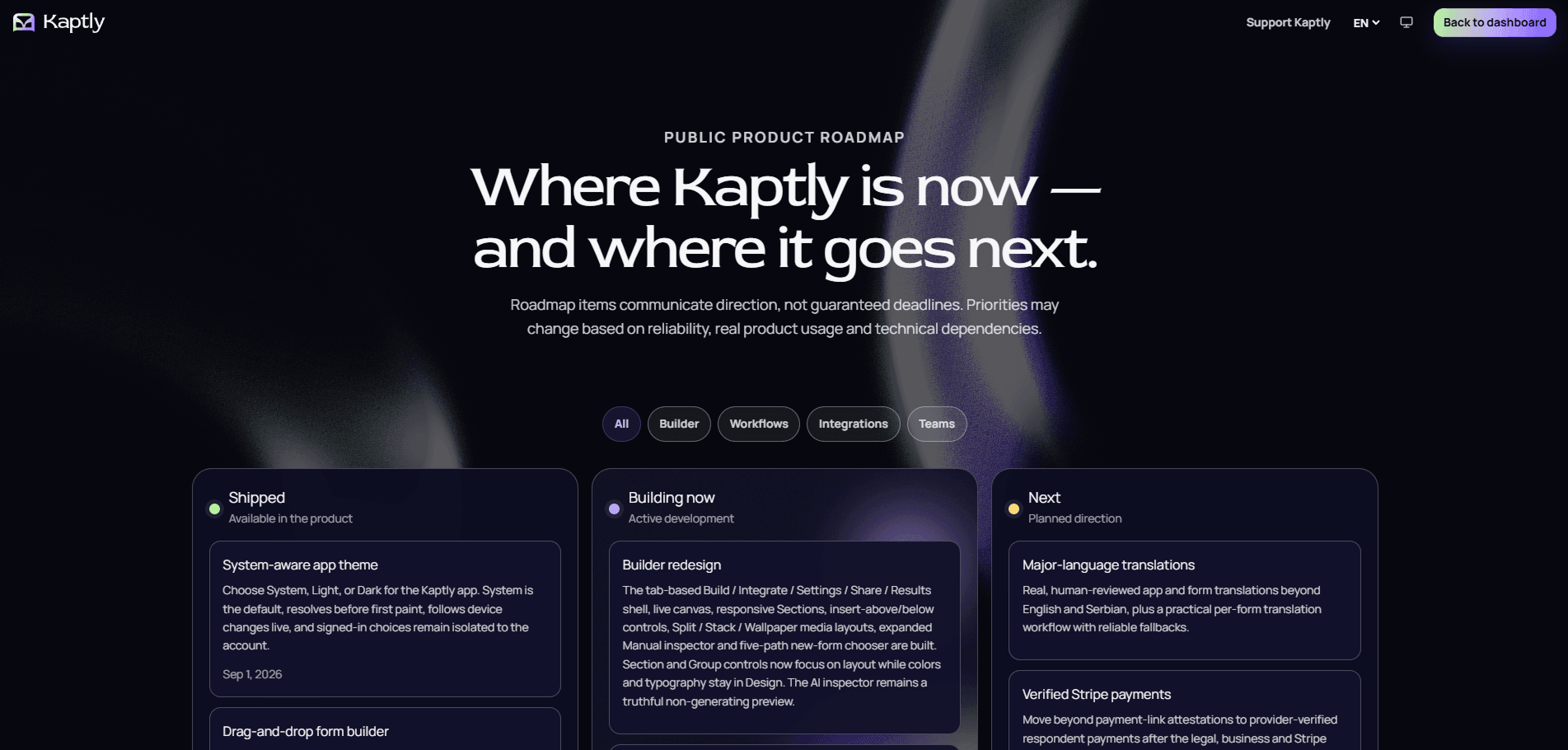
Decisions first, platform later.
The first release centered on branded forms, conditional logic, answer piping, qualification scoring, file collection, automations, and signed webhooks. Documentation, feedback, and a public roadmap were treated as part of product readiness, while broader platform ambitions remained visible but outside the immediate promise.
Chapter
04
Positioning & Identity
Brand system
Capable enough for operations. Approachable enough to adopt.
Kaptly needed to sit between generic form software and enterprise sales tooling. The name, language, and visual system were built around movement and readiness: deep ink creates operational focus, green and violet signal progression and customization, and direct copy keeps technical capability understandable.
Chromatic system
A restrained base with active signals
The interface uses a quiet foundation and a luminous two-color signal so important actions feel immediate without making the product visually noisy.
#06060FDeep ink
#100D25Product surface
#B7F29EIntake green
#7858FFWorkflow violet
#F4F2F8Interface white
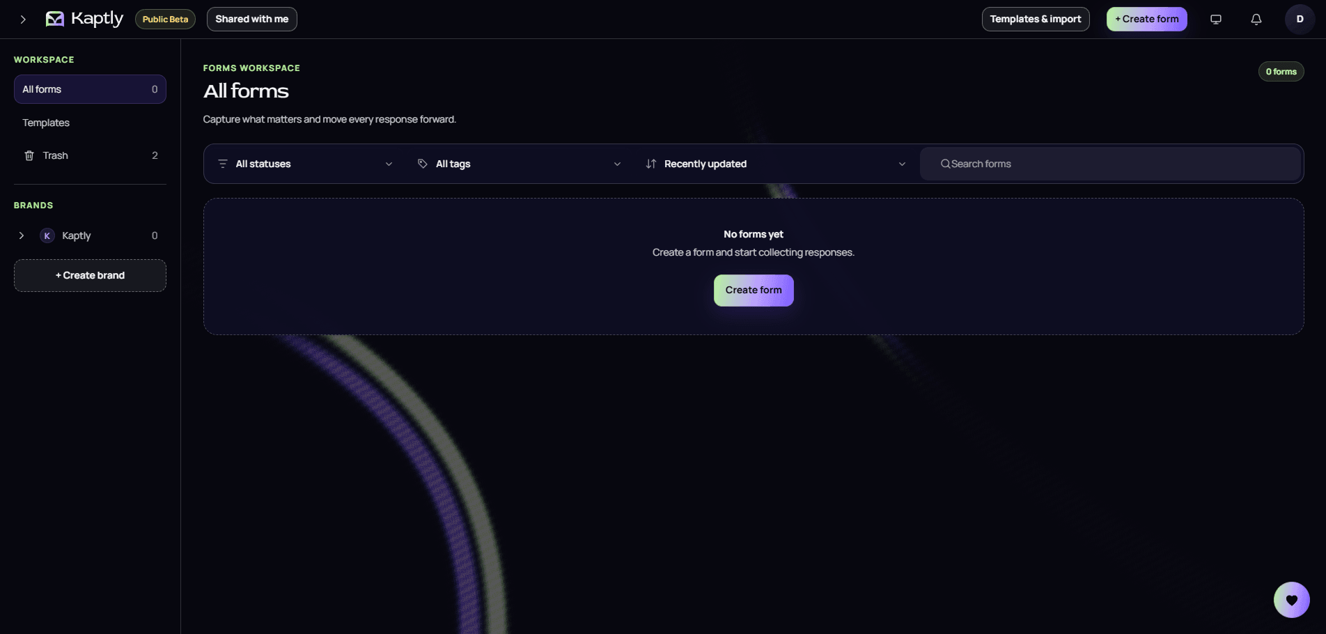
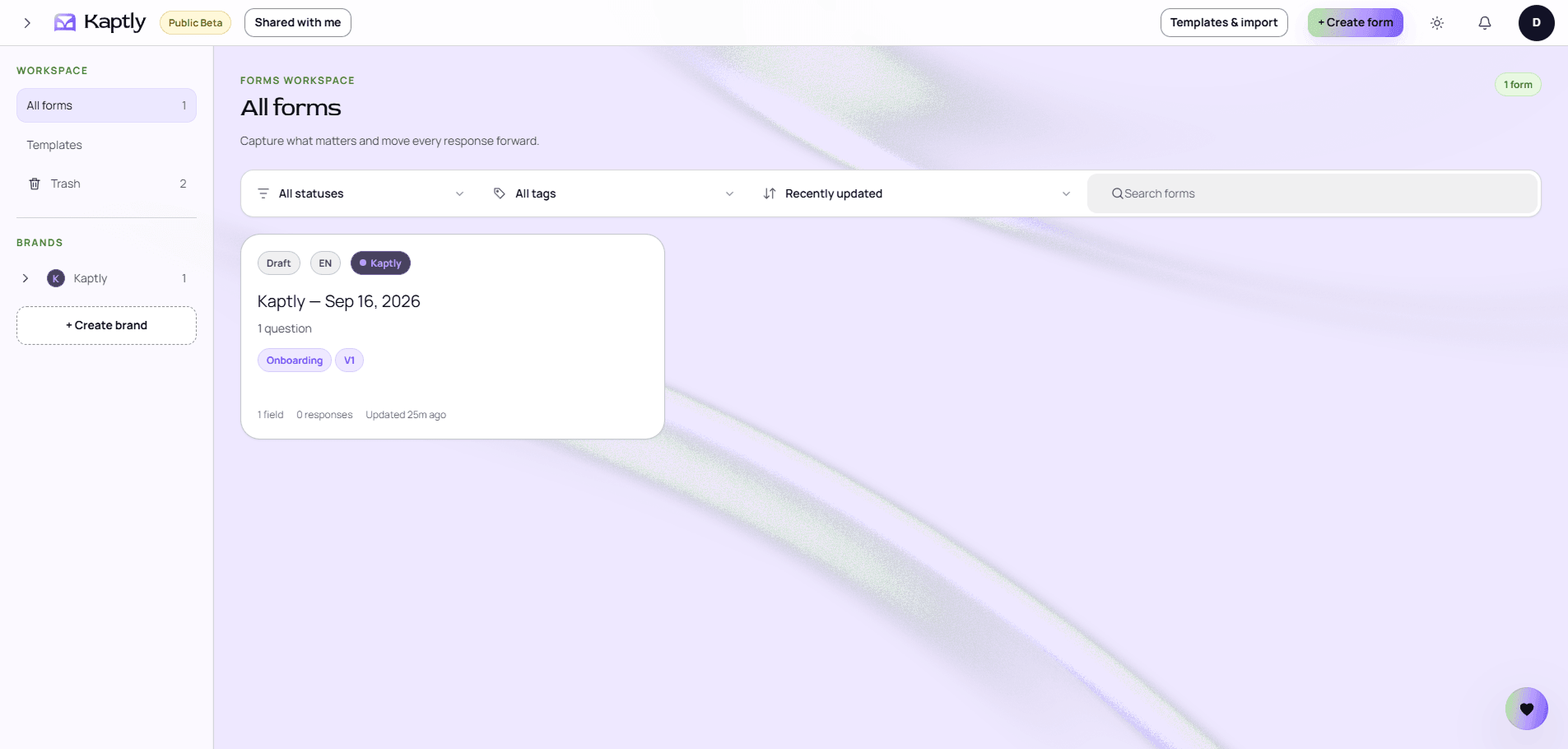
One identity in both editions: the app follows the device, or a chosen light or dark theme.
Chapter
05
Product Experience
Interaction principle
Make the next decision obvious without hiding flexibility.
The experience extends beyond the builder into reusable brand settings, creation and publishing flows, conditional behavior, qualification results, automations, onboarding, documentation, feedback, and account management. Each surface was reviewed against one standard: make the next action clear without flattening the workflow.
Starting point
Start from a workflow.
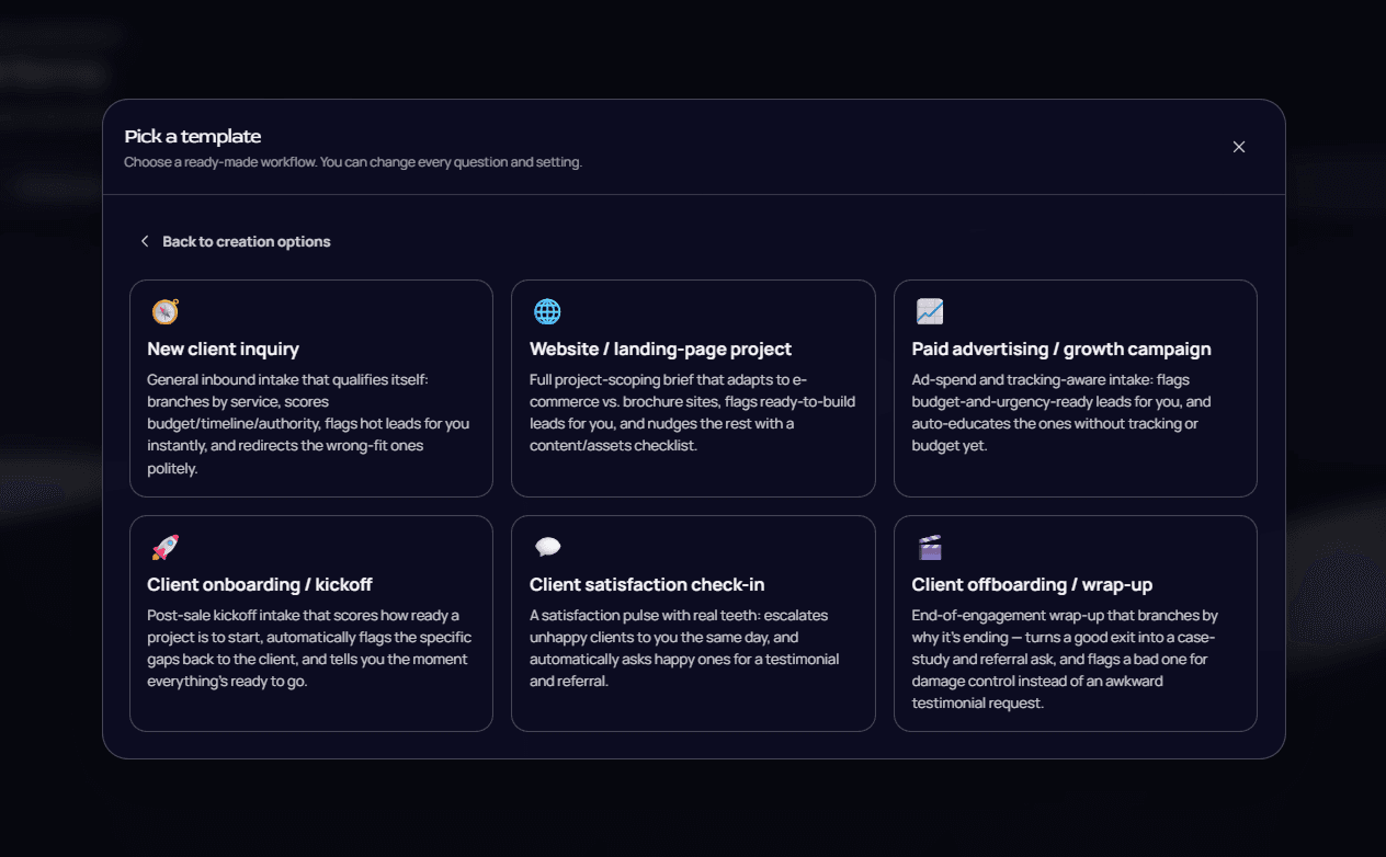
A new form begins with AI, a blank canvas, or one of six client-workflow templates. The templates arrive with their decisions already built in: a new client inquiry branches by service, scores budget, timeline, and authority, flags hot leads, and politely redirects the wrong fit. However a form starts, everything stays editable in the builder.
Brand styles
Set the brand once.
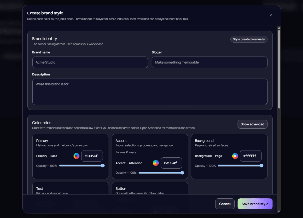
A brand style holds the name, slogan, logo, font, and color roles—primary, accent, background, text, and button—each defined by the job it does. Forms inherit the system, and any override on a single form can be reset back to it, so intake stays on brand without being restyled form by form.
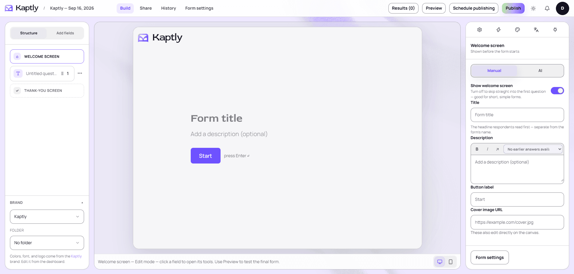
Structure on the left, the live canvas in the middle, the toolbox on the right. Every field is edited in place, and desktop and mobile previews are one click apart.
Chapter
06
Adaptive Intake

In detail
One toolbox, five tabs.
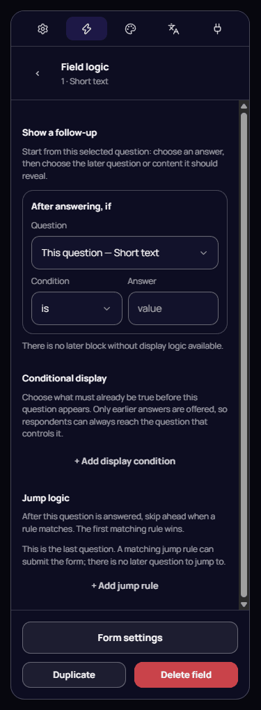
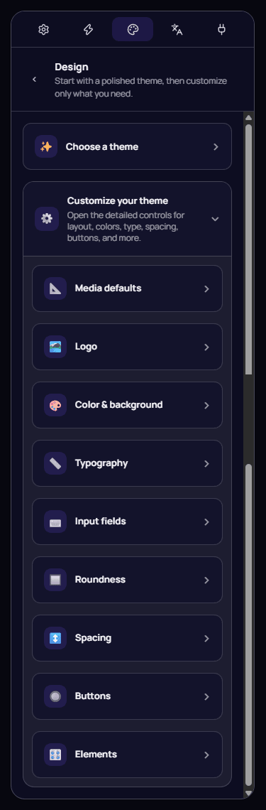
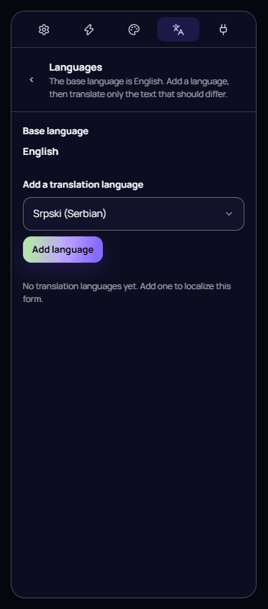
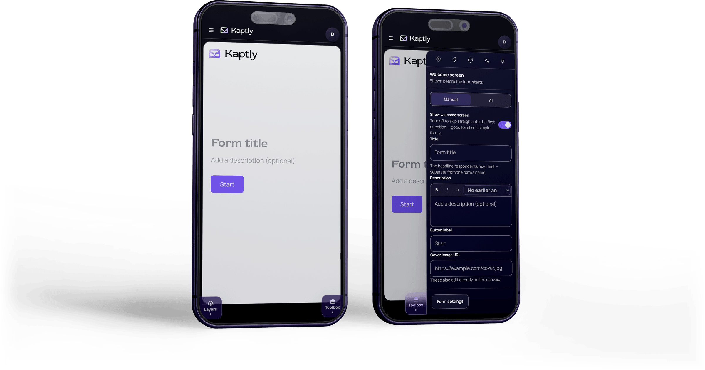
The toolbox gathers what a field can do into settings, logic, design, languages, and integrations. Field logic is where intake adapts: a follow-up reveals a later question from a chosen answer, conditional display offers only earlier answers so every question stays reachable, and jump rules skip ahead—the first matching rule wins.
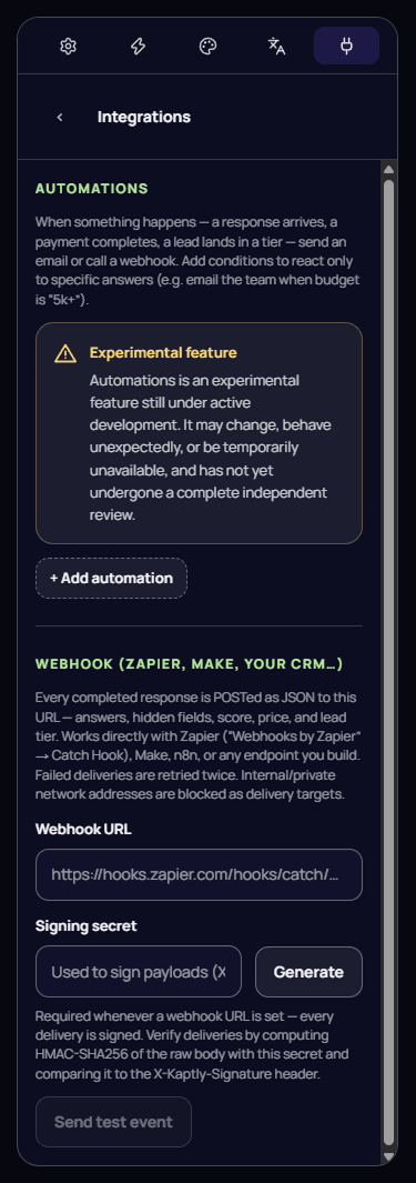
Design starts from a polished theme and opens only what needs to change, from logo and typography to input fields, roundness, spacing, and buttons. Integrations post every completed response—answers, hidden fields, score, price, and lead tier—to Zapier, Make, n8n, or any endpoint, with every delivery signed and failed ones retried.

Chapter
07
Sharing & Results
Publishing
One form, every way in.
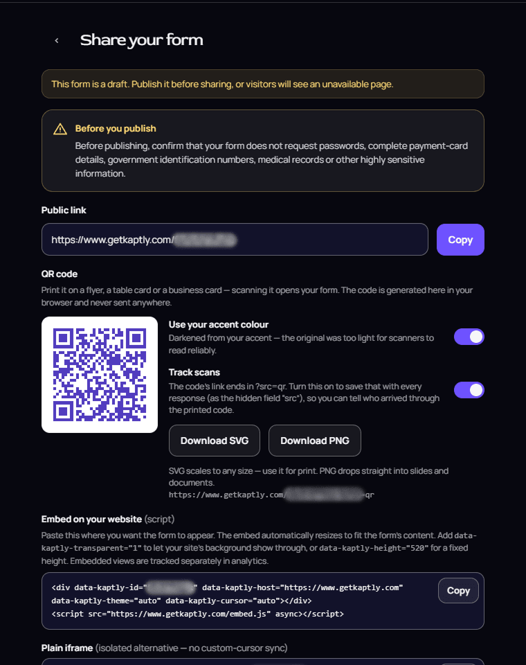
A form goes live now or on a schedule, and only after the owner confirms it asks for nothing highly sensitive. From there it travels as a public link, a QR code generated in the browser—with optional scan tracking—or an embed: a script that resizes to its content, a plain iframe, or a floating popup button.
Results
See where intake stalls, not only what arrived.
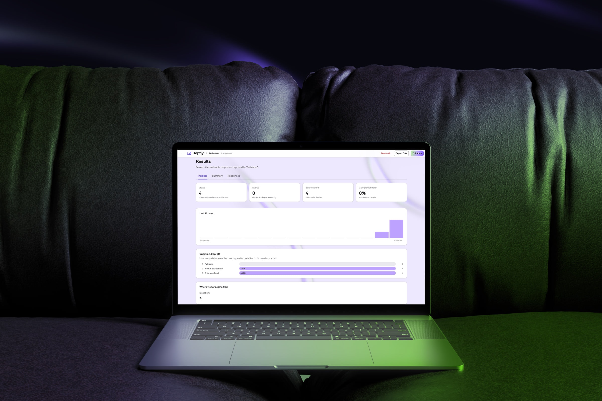
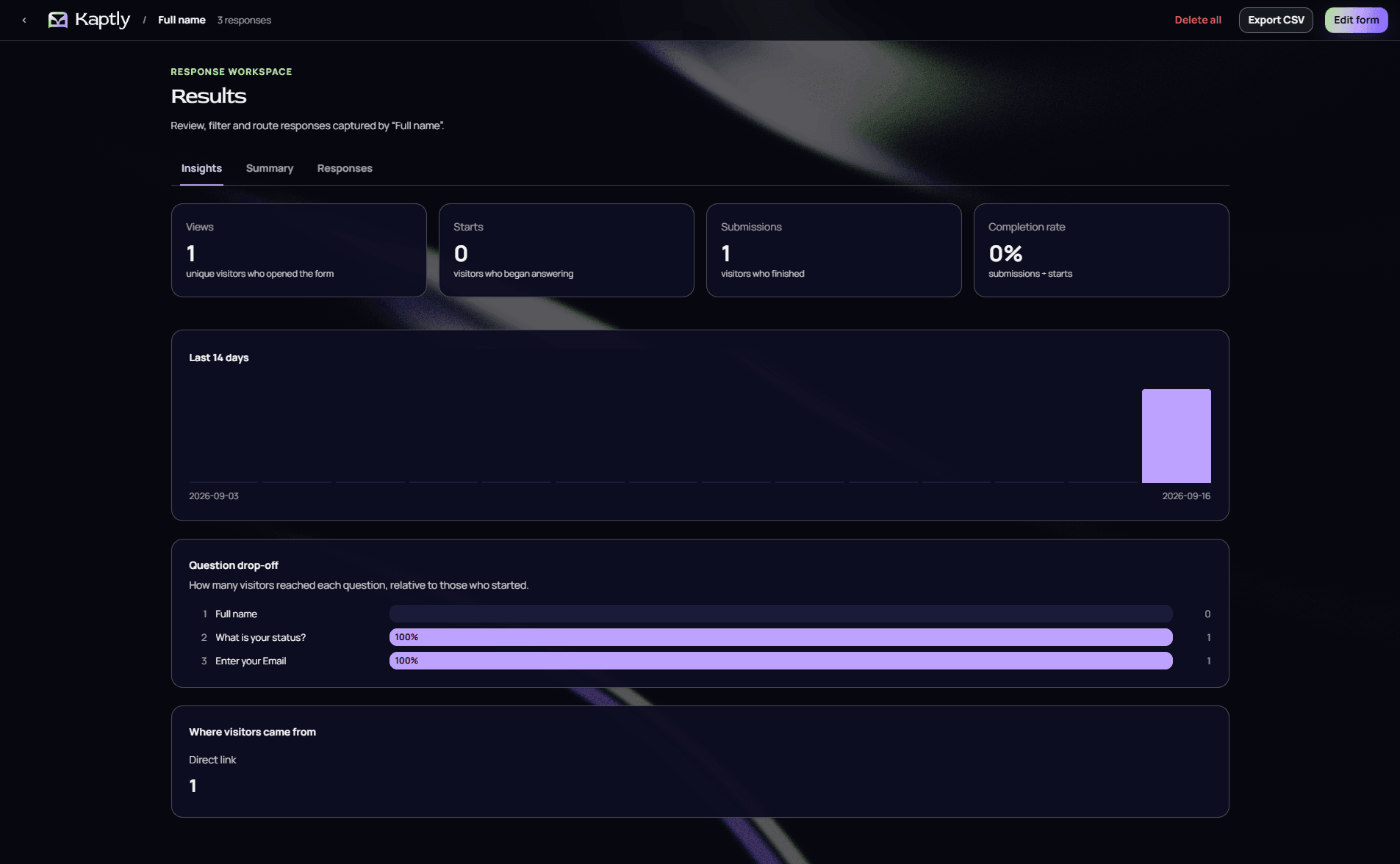
Insights track views, starts, submissions, and completion rate, a 14-day trend, drop-off question by question, and where visitors came from—so a form that loses people on its second question says so. Summary groups answers by question; Responses keeps every submission.

Completed and partial submissions share one table, filtered by status and exportable to CSV—an unfinished inquiry stays visible for follow-up.
Chapter
08
Mobile Experience
Mobile
The whole builder, within thumb’s reach.
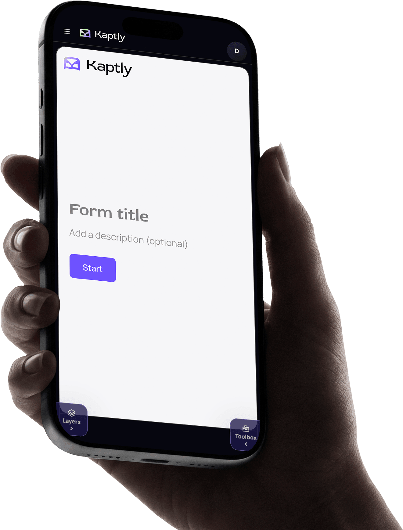
On a phone the builder keeps its full reach rather than shrinking into a preview. Layers and Toolbox slide in from either edge of the canvas, and builder navigation—build, share, history, form settings, results, preview, scheduling, and publishing—sits behind a single menu.
Chapter
09
Launch System
Go to market
Outcome first, then proof.
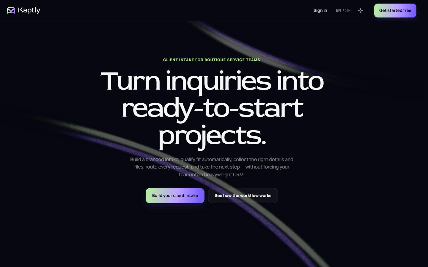
The public site starts with the result—ready-to-start projects—then uses adaptive questions, branding, qualification, and automation as evidence. The guide explains real workflows, the roadmap separates shipped work from direction, and public-beta language keeps the promise aligned with the product’s current maturity.
Onboarding
Five small steps to a first form.
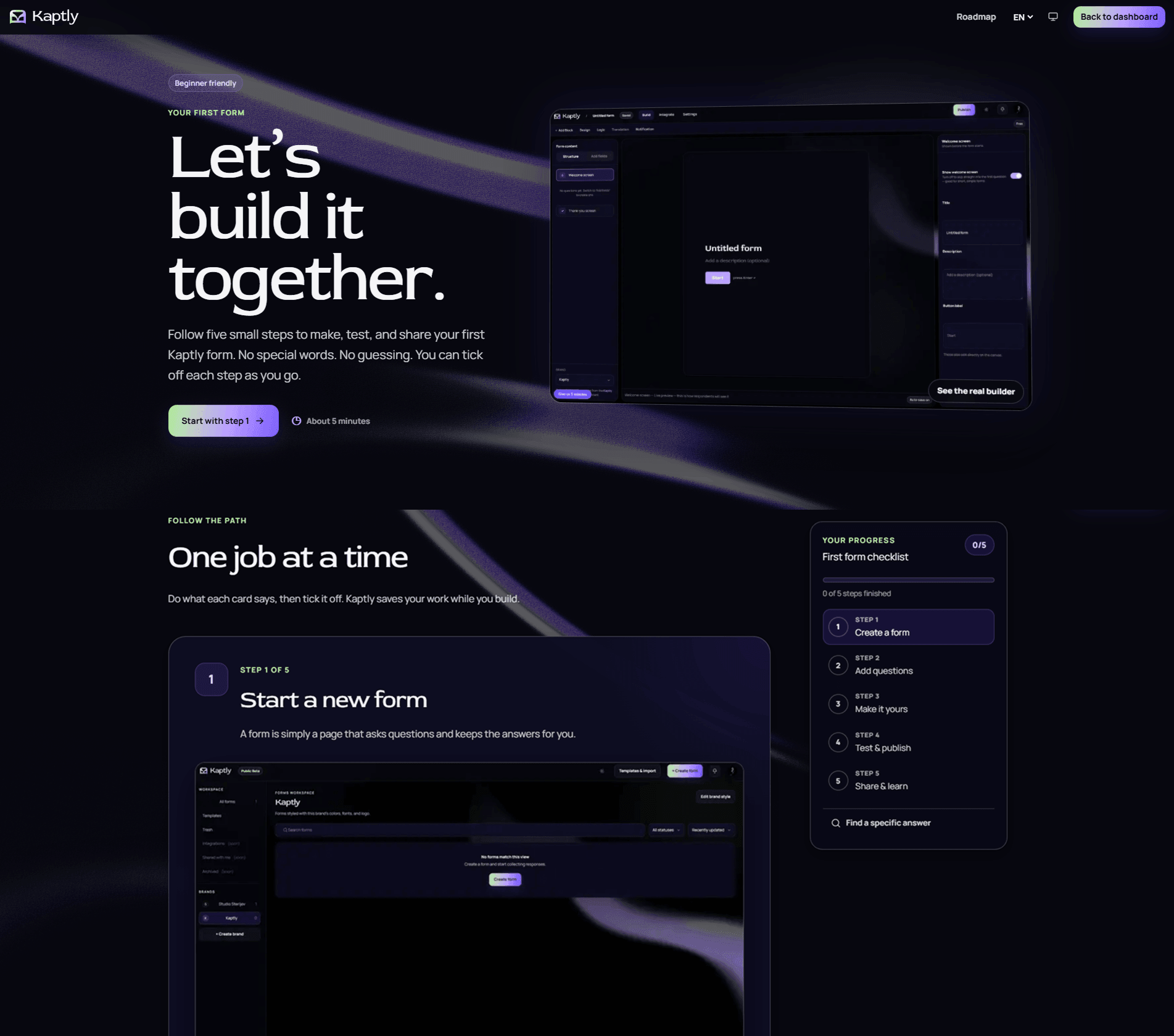
The in-app guide turns documentation into a path: create a form, add questions, make it yours, test and publish, then share and learn. A checklist tracks progress, each step shows the real builder, and search finds a specific answer when the path is not enough.
Chapter
10
What Ownership Changed
Kaptly required product, brand, UX, and go-to-market decisions to work as one connected system—not as separate deliverables.
In detail
Owning the product gave every design choice an operational consequence. Positioning set product boundaries; naming and tone shaped onboarding; workflow decisions affected automation and support; documentation exposed ambiguity that polished screens could hide.
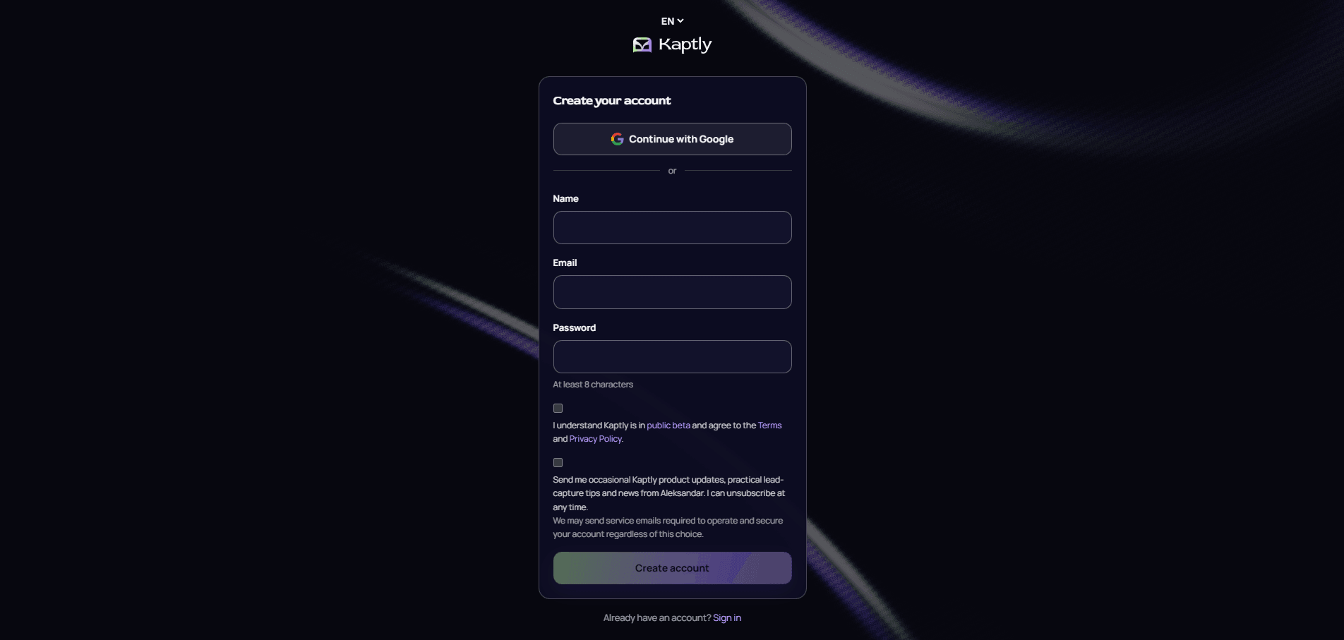
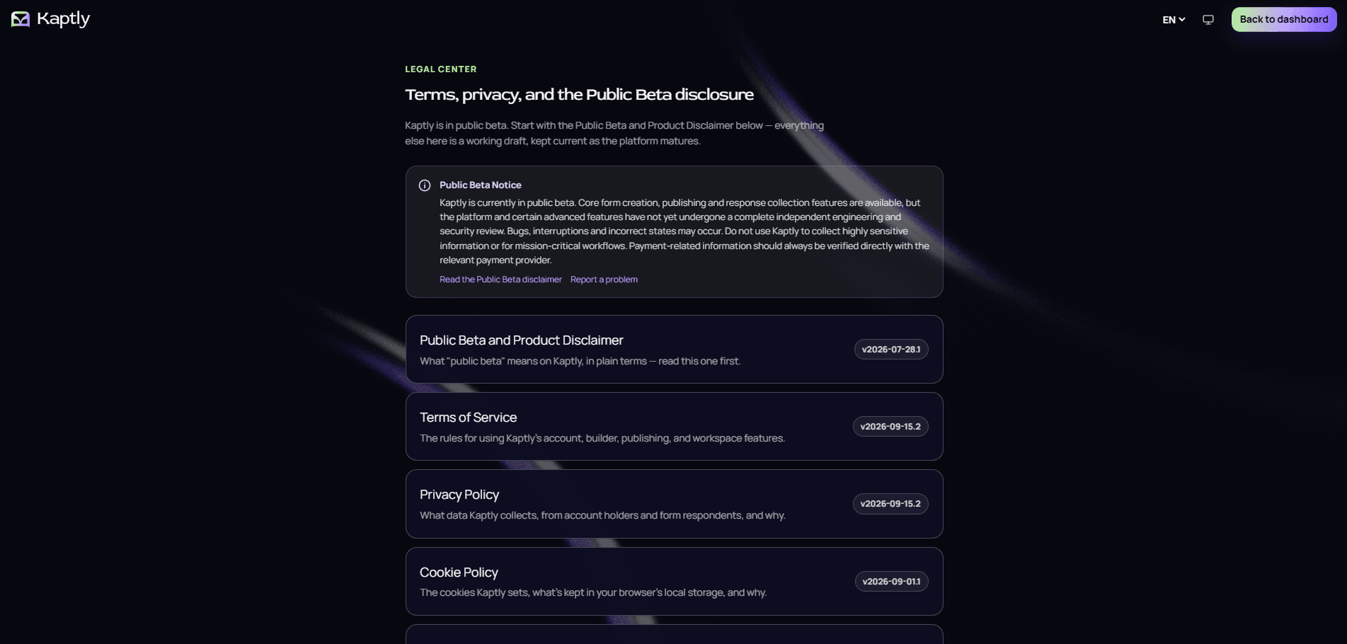
It also required a stricter standard of honesty: distinguish shipped capability from roadmap direction, public beta from mature platform, and a coherent release from a finished product. That discipline now informs how Studio Šterijev approaches client work.
Chapter
11
Current State
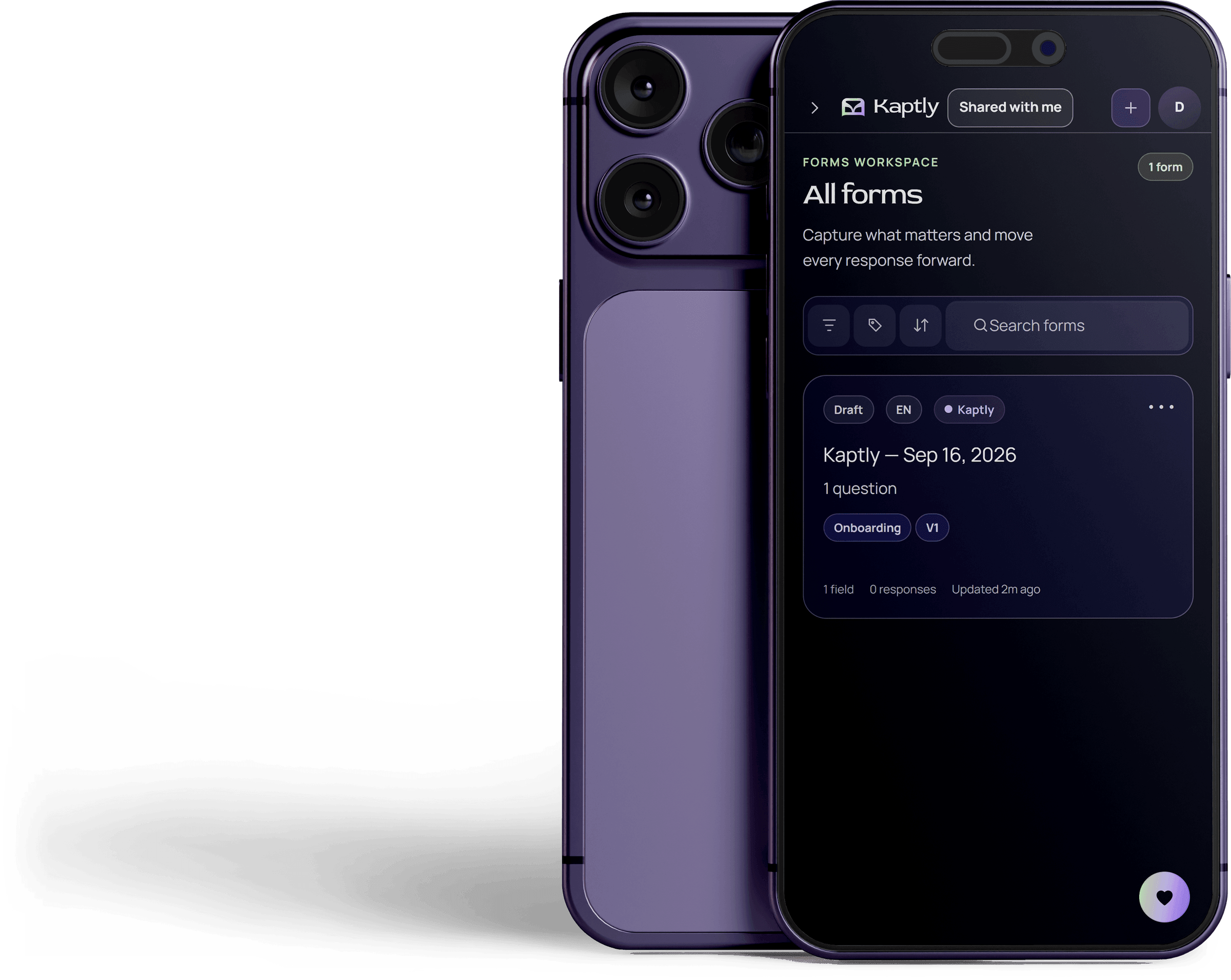
Kaptly is live in public beta on desktop and mobile. Core intake, conditional logic, answer piping, brand controls, scoring, automations, webhooks, templates, bilingual forms, and sharing are available today. The public roadmap separates shipped capability from active development and future direction.