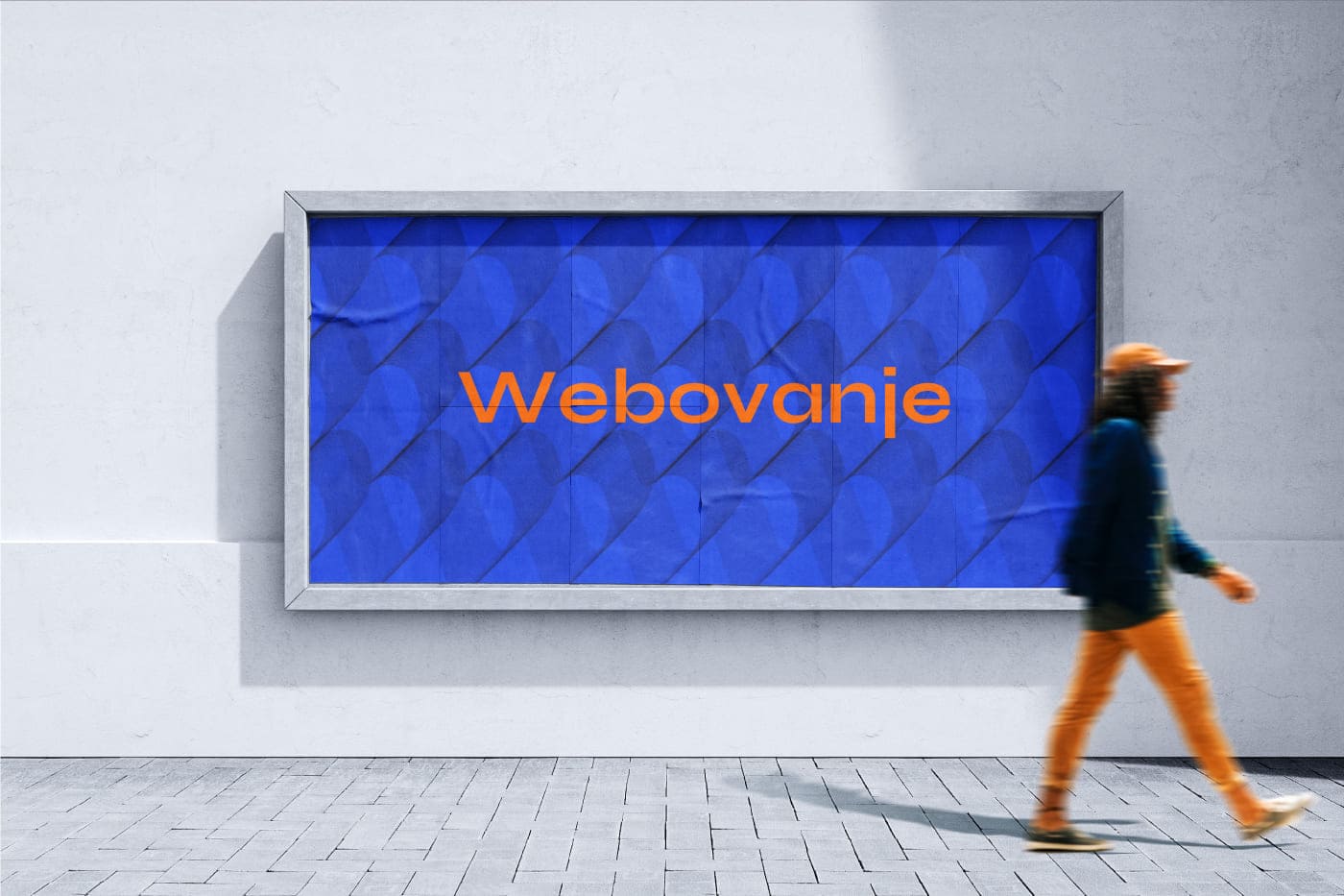
Voyant – Brand Development

Industry
Financial Services, Professional Advisory
Client
Voyant
Service
Luxury Brand Identity, Brand Strategy, Logo Design, Typography & Color Systems
Date
December 2024
Voyant is a private advisory and creative house for those shaping what endures — people who shape culture and leave a legacy.
Client’s Goal
Design a visual identity that communicates quiet power, elegance, and intelligence. The brand should feel exclusive, timeless, and sophisticated, like a piece of art in a gallery, rather than a traditional corporate logo.
The target clients are wealthy individuals who want to build something enduring, something with depth and meaning. They are looking for discreet power, not attention. This brand needed to speak to their desire for subtlety, intelligence, and long-term impact.
⦿ Identity: A high-end visual identity for a consultancy that helps clients build lasting legacies.
⦿ Tone: Deep, emotional, visionary luxury, and quiet strength.
⦿ Target Audience: High-net-worth individuals and cultural leaders who value legacy over fame.
⦿ Deliverables: Wordmark, symbol, color palette, typography system, and mockups for digital and print applications.
⦿ Key Concept: The brand should feel like a hidden secret that’s been discovered, not something shouted about.
Inspiration
The direction for Voyant started with the client’s custom brand discovery form. Their answers helped define the core themes we needed to work with: meaning, culture, symbolism, emotional intelligence, and a sense of timeless, discreet strength.
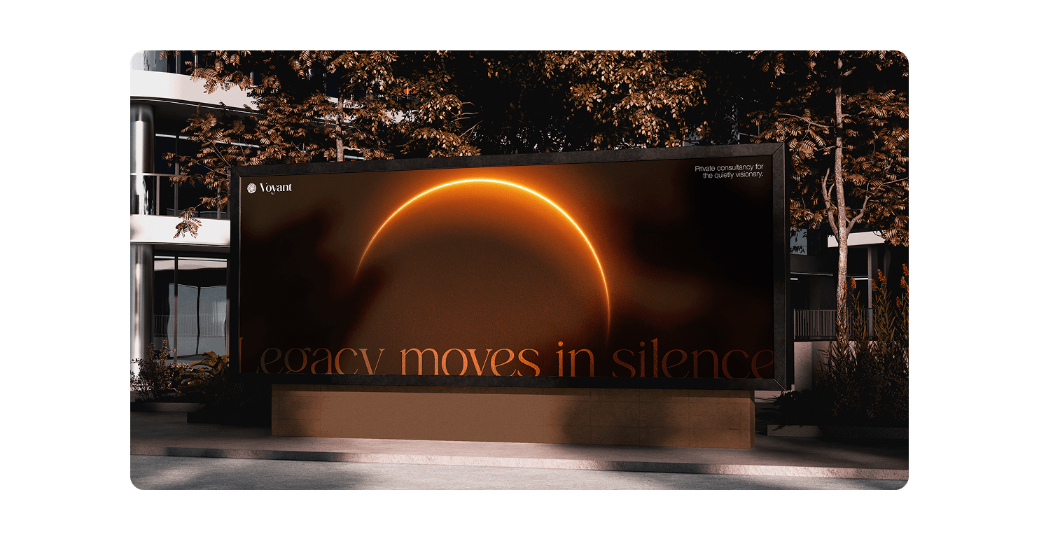
From there, the idea of the eclipse became a natural fit. It captured everything we were aiming for — something iconic but not loud, mysterious but still purposeful, and visually connected to the idea of growth and vision. This formed the foundation for the overall identity and guided the look, feel, and tone of the brand.
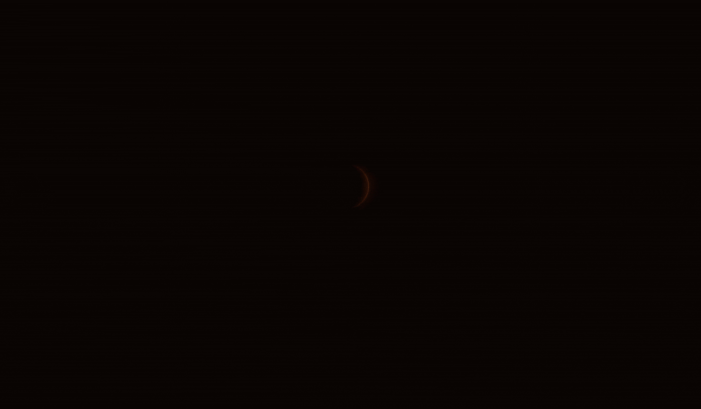
The Symbol
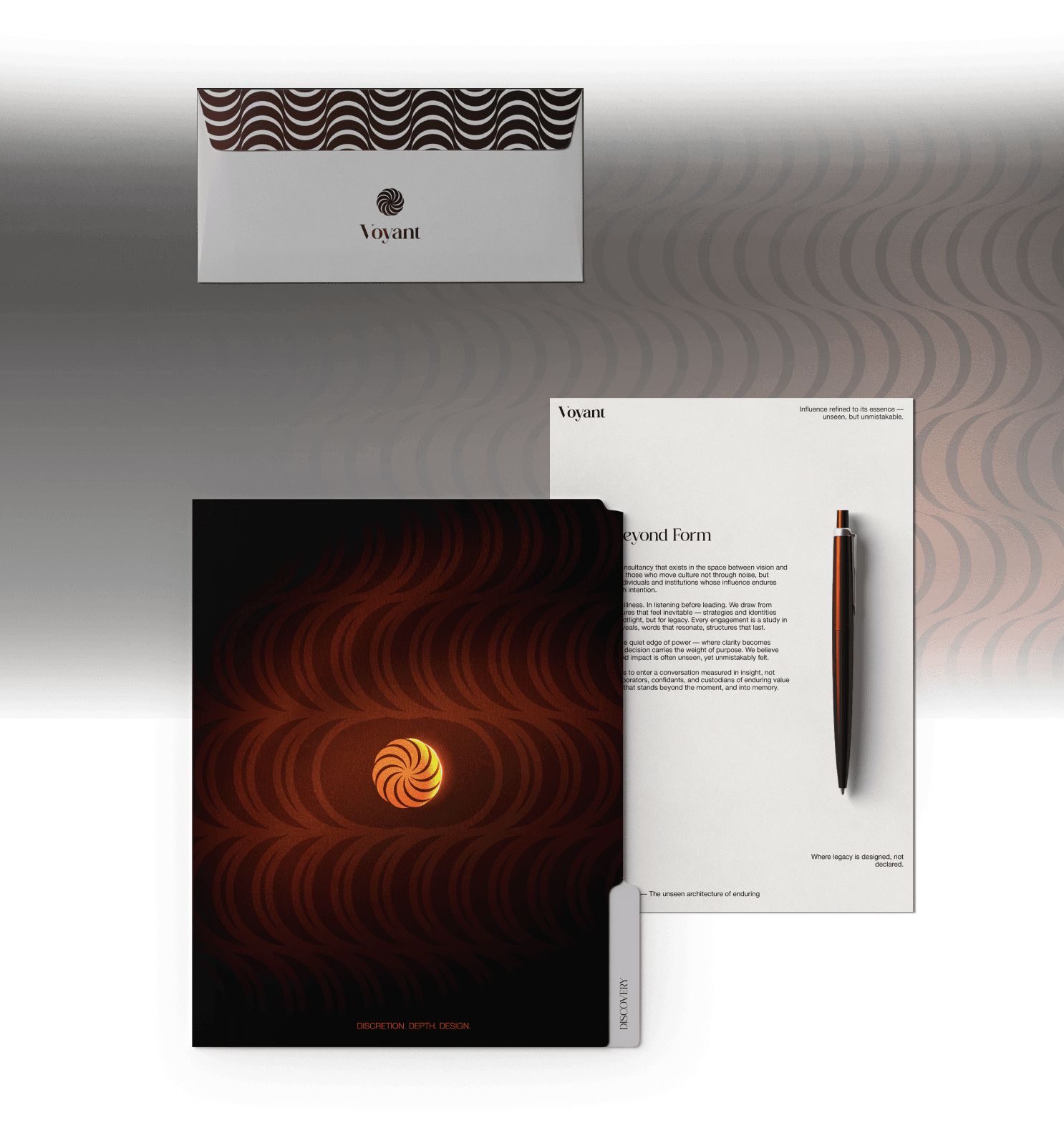
The eclipse
It represents mystery and beauty — a quiet power within us all, waiting to be revealed. I chose the shape of the Waxing Crescent Moon, a phase that symbolizes beginnings, growth, and the journey toward fullness. It’s warm orange glow reflects that magical moment when the Moon rises on the horizon — radiant, emerging from shadow — a reminder of renewal, discovery, and the promise of something greater.
The spiral
⦿ The shape moving to the right shows progress and movement in the right direction.
⦿ It’s made up of 10 crescent shapes, each representing one stage of growth — a journey of becoming.
⦿ The number 10 is meaningful because it represents the completion of a cycle, something we can all connect with, both physically and spiritually.
⦿ This motion that completes the full circle also connects to the idea of the “full moon” — representing the goal of reaching your full potential.

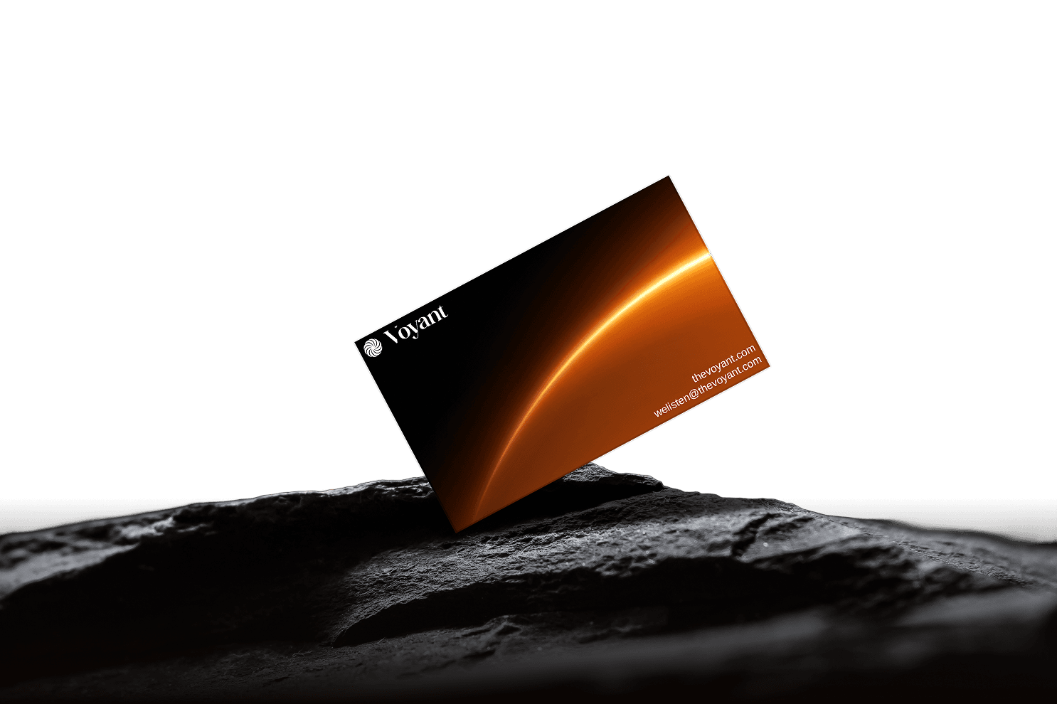
Wordmark
The elegant “TT Gateral” font family conveys luxury and sophistication—qualities that resonate with people striving for a higher purpose. It’s modern yet timeless, perfectly reflecting the brand’s refined and exclusive character.
The Logo
Logo variants
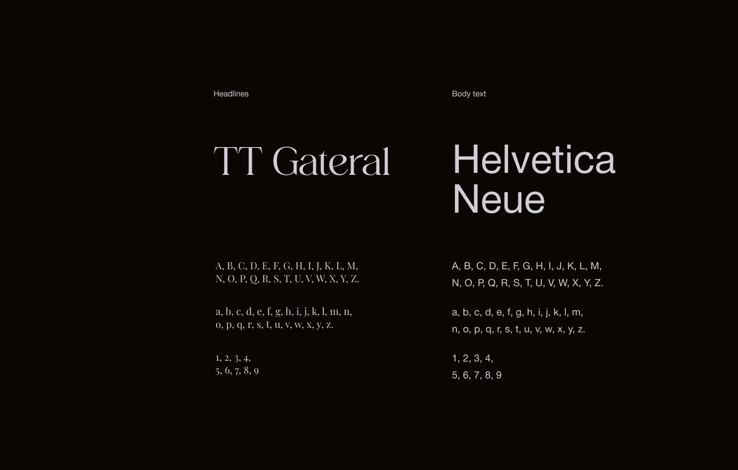
Typography
TT Gateral & Helvetica Neue
A premium pairing that communicates confidence, stability, and refined intelligence across every touchpoint.
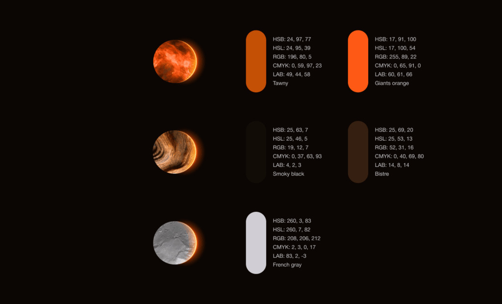
Colors
The colors are built around the atmosphere of an eclipse and the natural elements connected to it.
⦿ #D0CED4 — inspired by stone and mineral textures; soft, calm, and grounding.
⦿ #341F10 — a deep wood tone that brings warmth and stability.
⦿ #130C07 — a dark, shadow-like base that adds depth and contrast.
⦿ #C45005 and #FF5916 — warm orange tones taken from the light that appears around the eclipse, adding energy and a sense of movement.
Together, the palette feels natural, warm, and intentional — all flowing with the idea of transformation, new beginnings, and building something meaningful over time.
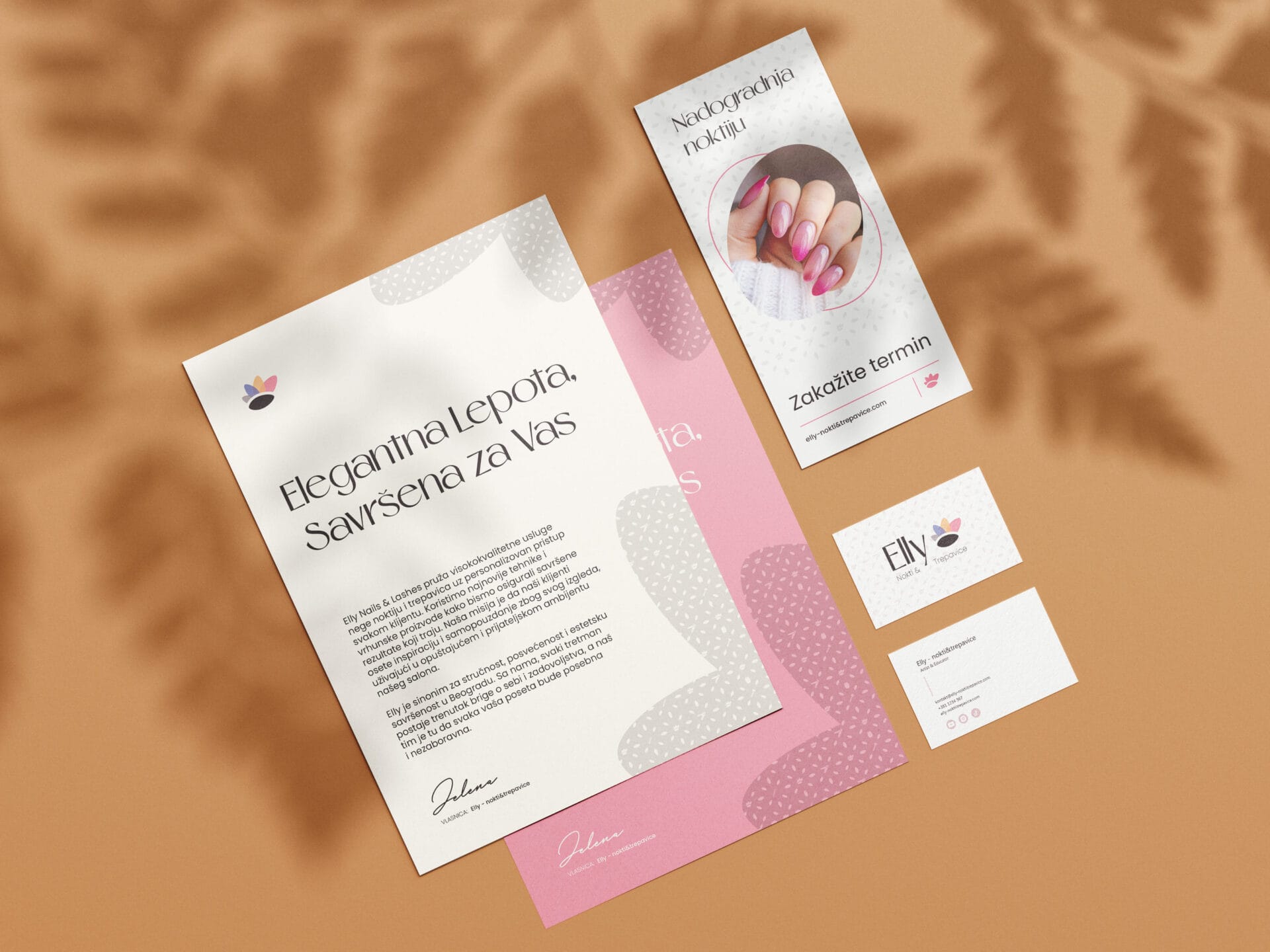
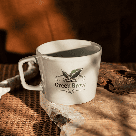
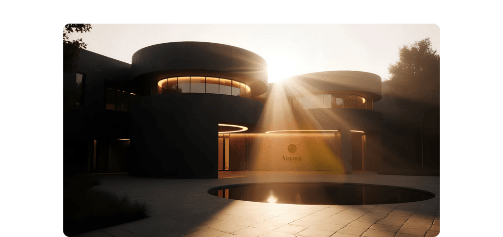
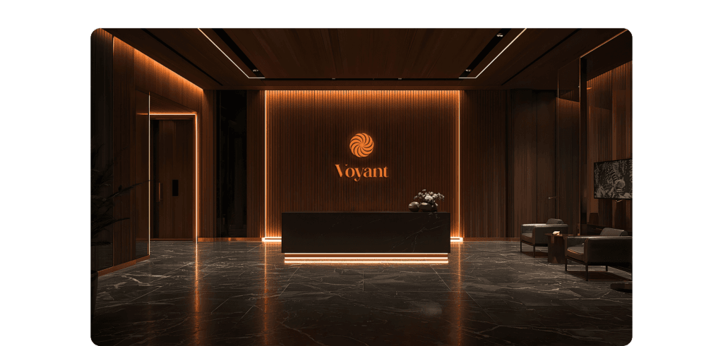
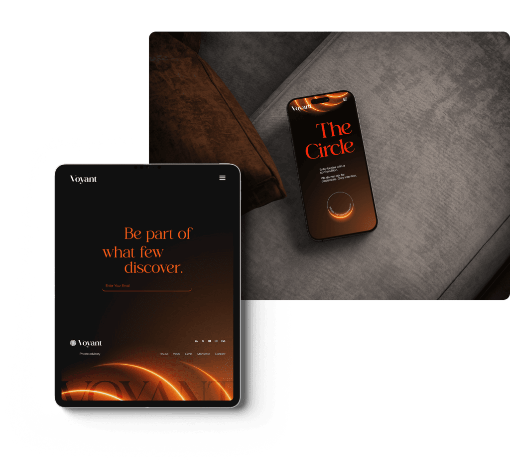
Logo usage & mockups
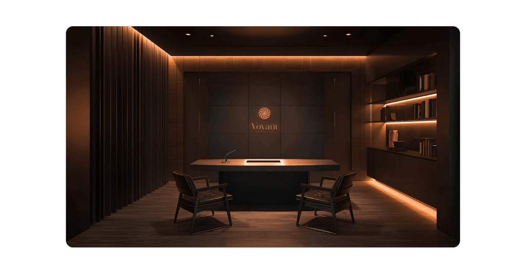
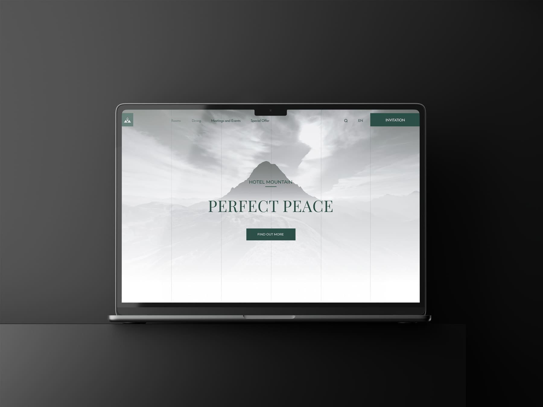
Web UI

Ready to Elevate Your Project?
Are you inspired to embark on a journey that transforms your vision into reality? Book a call with me, and let’s explore how we can bring your project to life with the same precision, creativity, and attention to detail that Voyant exemplifies. Together, we will create something extraordinary.