Webovanje – Brand Development

Industry
Design, Education
Client
Webovanje
Service
Brand Identity, Brand Strategy, Target Group, Logo Design, Brand Tone & Voice, Web Design
Date
February 2024
PROCESS
Webovanje is a brand designed by adhering to the principles of the rational model. For each of the segments that needed to be designed, the process included four key factors:
1. Understanding 2. Research 3. Testing 4. Solution
IDEA
The idea for this project is to enrich the knowledge of graphic design enthusiasts by providing educational information, inspiring with examples of final project solutions, and teaching the use of various tools. In this way, the brand will support and inspire creative individuals who are not engaged in creative industries to explore the world of graphic design, a field that truly interests them.

TARGET GROUP
In order to better understand the target group, with the support of tools such as ChatGPT and Bard (Gemini), I started the process of segmenting it into several smaller groups. For each of these groups, totalling four, I identified key demographic characteristics:
- Age
- Location
- Interests
- Motivation
- Budget
- Challenges they face
- Educational level
In the context of the idea’s goal of connecting with the target group, the primary step was to determine the message I want to convey to potential clients.
The analysis of the collected demographic data allowed me to understand their needs and challenges more deeply, as well as to specify the profiles of people covered by the group.
I concluded that these are individuals who show a tendency towards exploring, learning, and creating. Using this information, the process naturally evolved to the next segment – choosing the brand name.
NAME
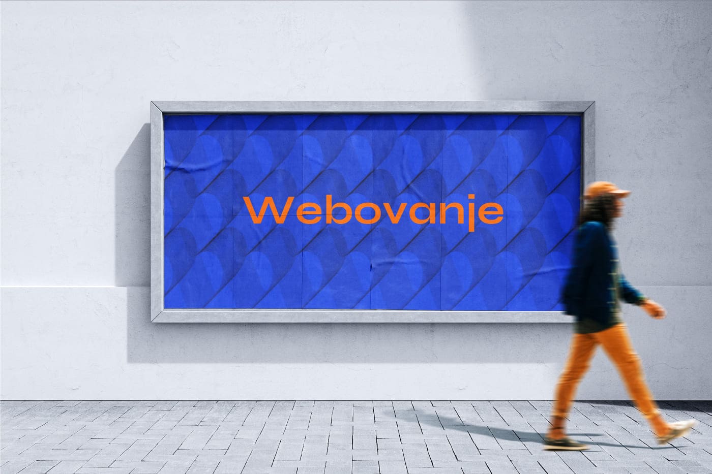
Making a parallel with the previously concluded profile of the target group – individuals who like to explore, learn, and create – I found a term that could connect these activities: “Googling”. In the Serbian language, this word is often used when you want to search for something on the internet, as in the phrase, “Google it on the internet”. Given that this word implies a clear action, I realised that the brand name should also carry similar directness. Thus, through a play on words, I transformed “Google” into “Web”, creating a new word with a similar meaning. This is how the name “Webovanje” was born.
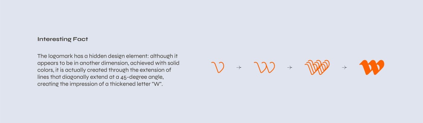
Q1 – Why “W” instead of “V”?
Because “Web” comes from “World Wide Web”, emphasising that the action takes place on the internet.
Q2 – What does webovanje mean?
The definition of “Webovanje” would be: searching for information about someone or something on the internet.
Although the meaning of “Webovanje” seems intuitive, the name lacked context. Therefore, wanting to send a clear message about the brand’s purpose, I adopted the slogan,
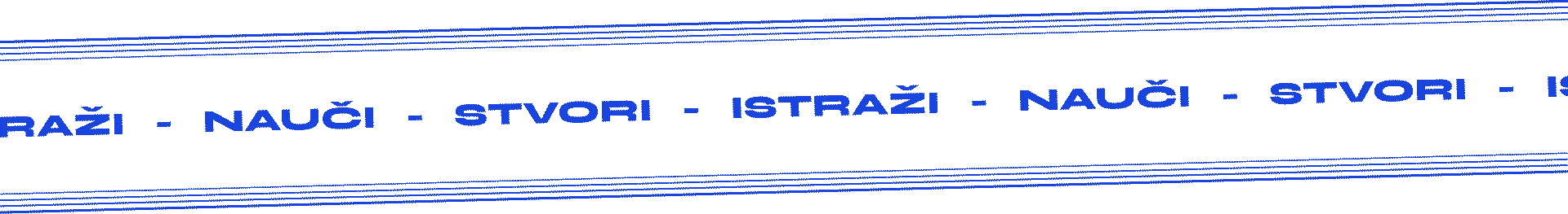
Explore – Learn – Create
RS: “Istraži – Nauči – Stvori”.
Furthermore, I checked the availability of the name by researching social networks, search engines, domain availability, and registration. All indicators pointed to the name being free for use, which encouraged me to proceed with customising the name.
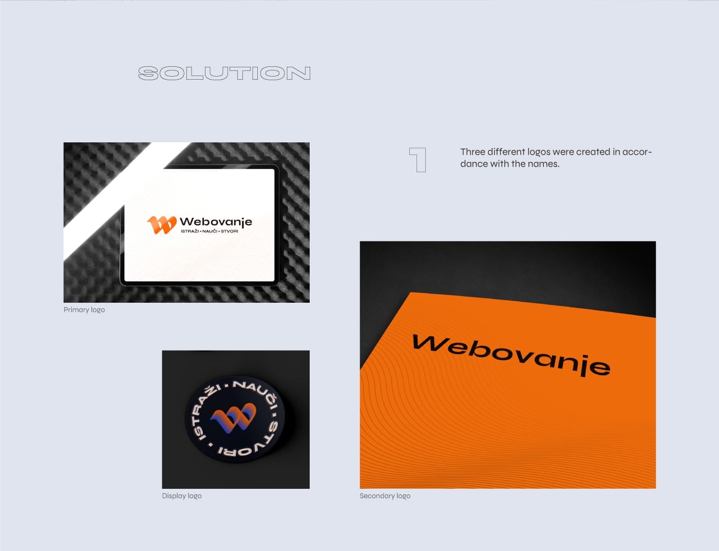
The brand received three different names, depending on the context of use and the needs for a visual identity:
- Full name: Webovanje – Istraži – Nauči – Stvori
- Secondary name: Webovanje
- Hashtag name, or name for use on social networks: WBVE
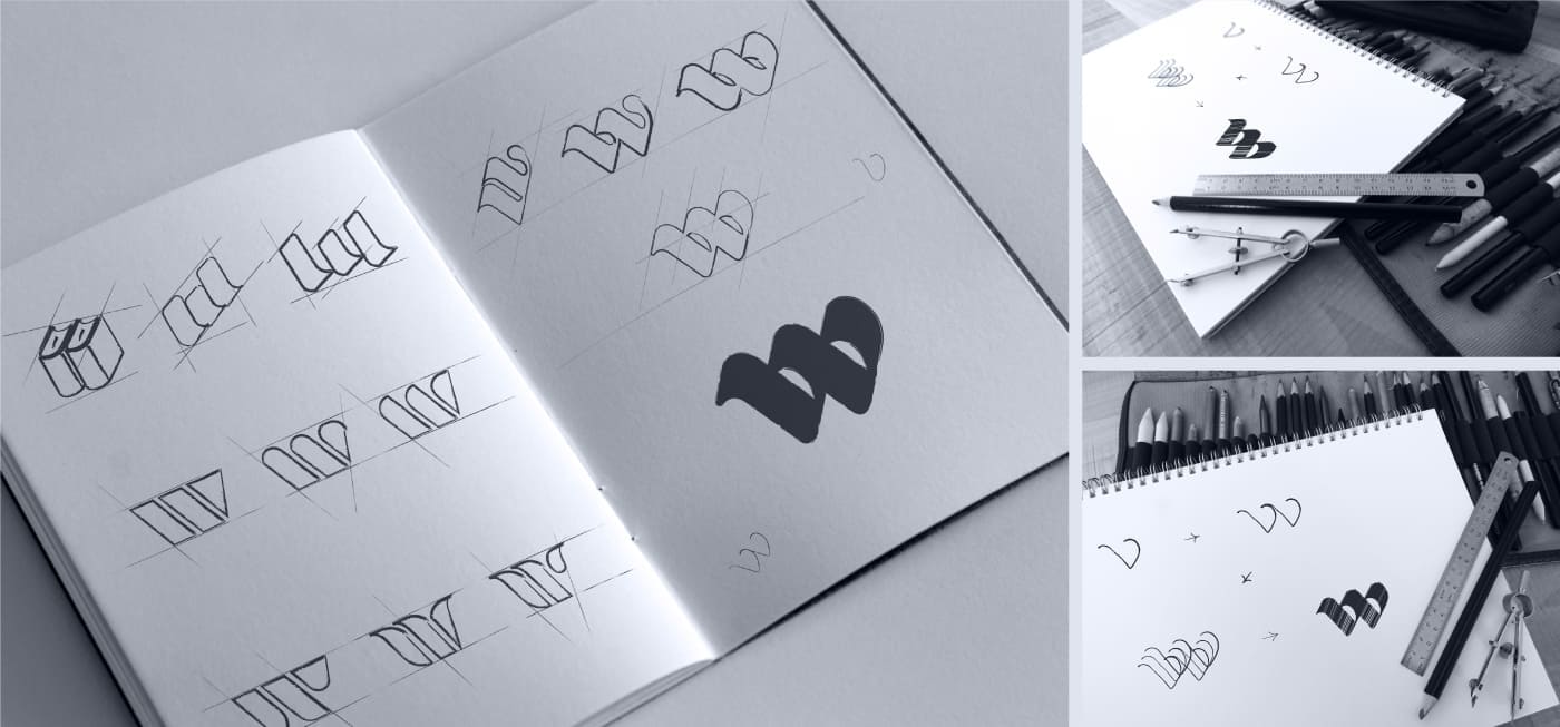
LOGO
The development of the logo was closely connected with all the gathered information, taking into account several key aspects:
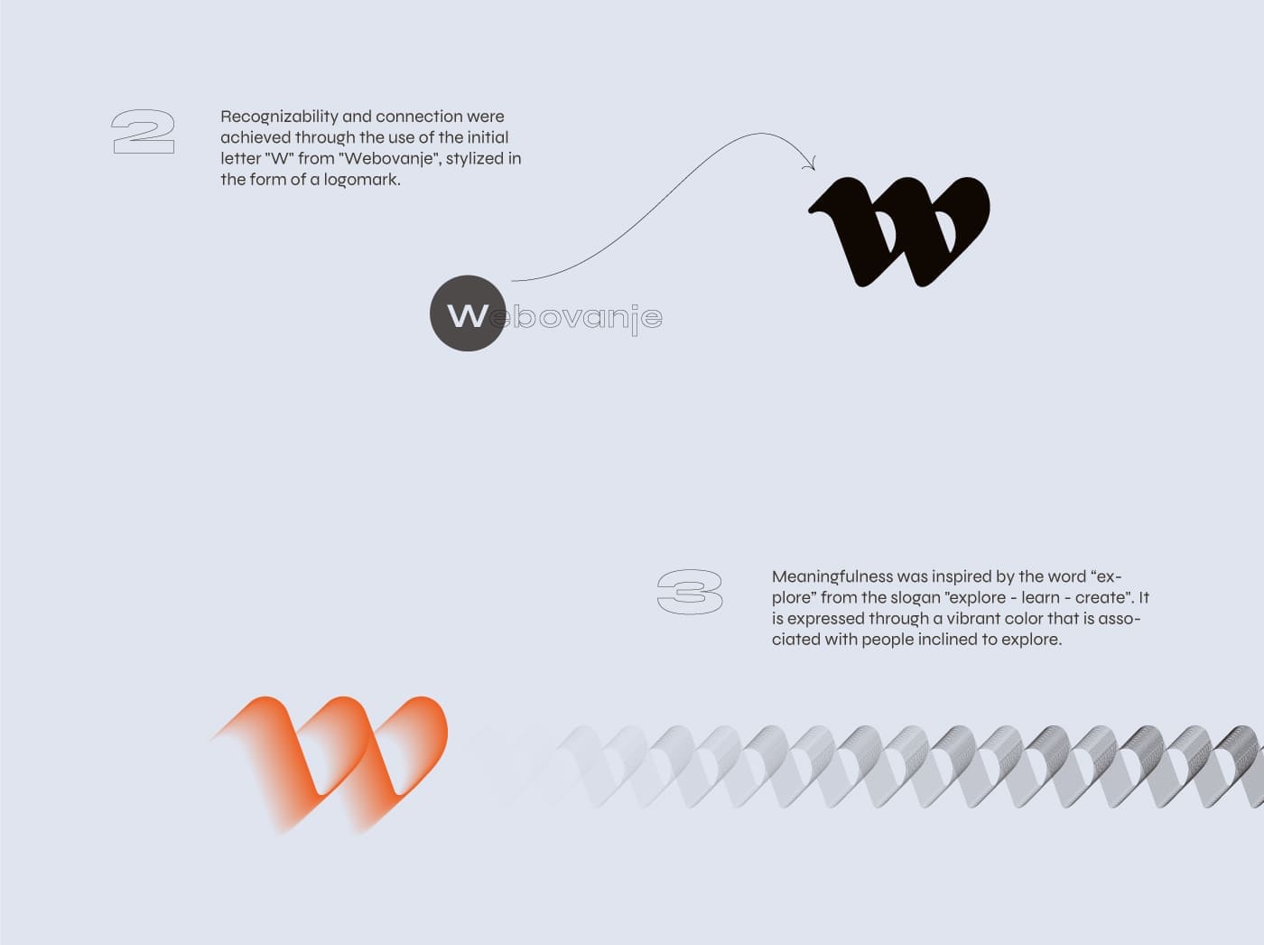
- Recognizability
- Meaningfulness
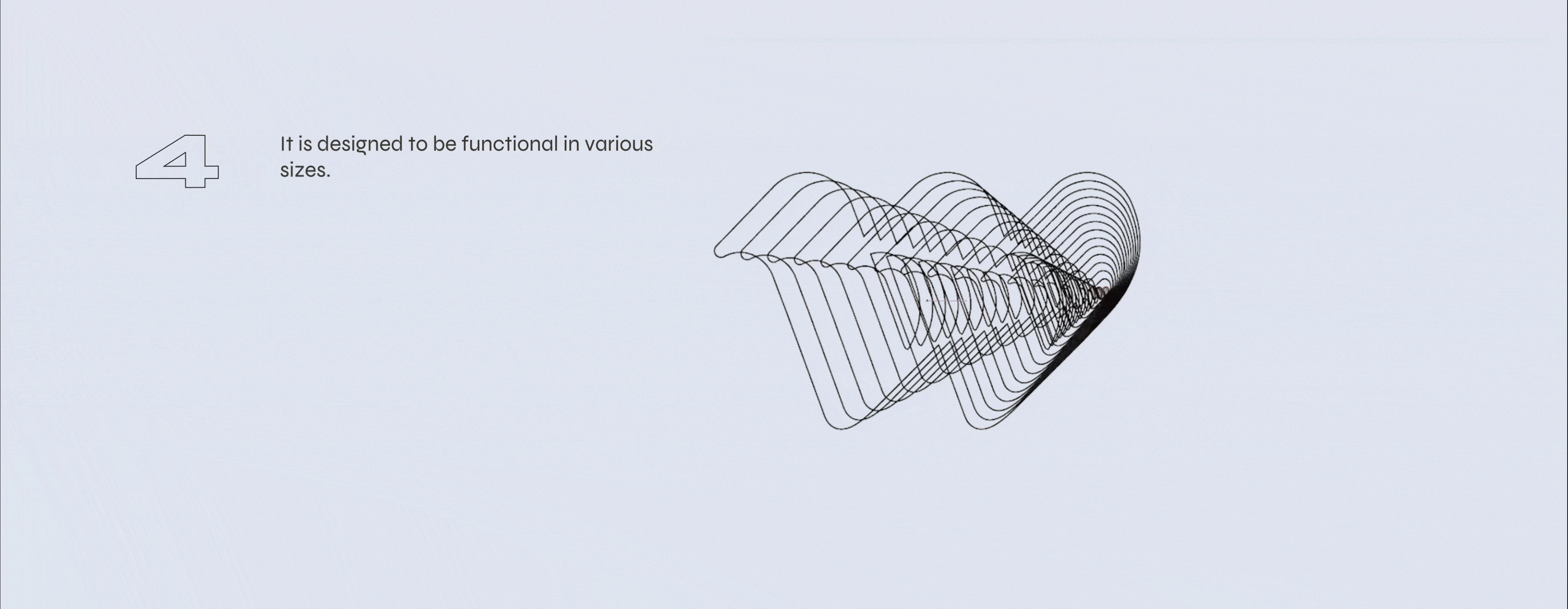
- Practicality of application
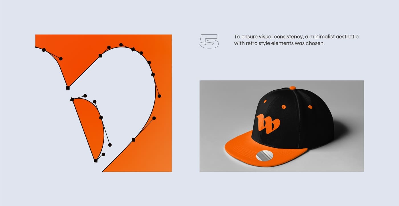
- Resistance to changes in styles
- Ability to convey messages and emotions
Logo Goals
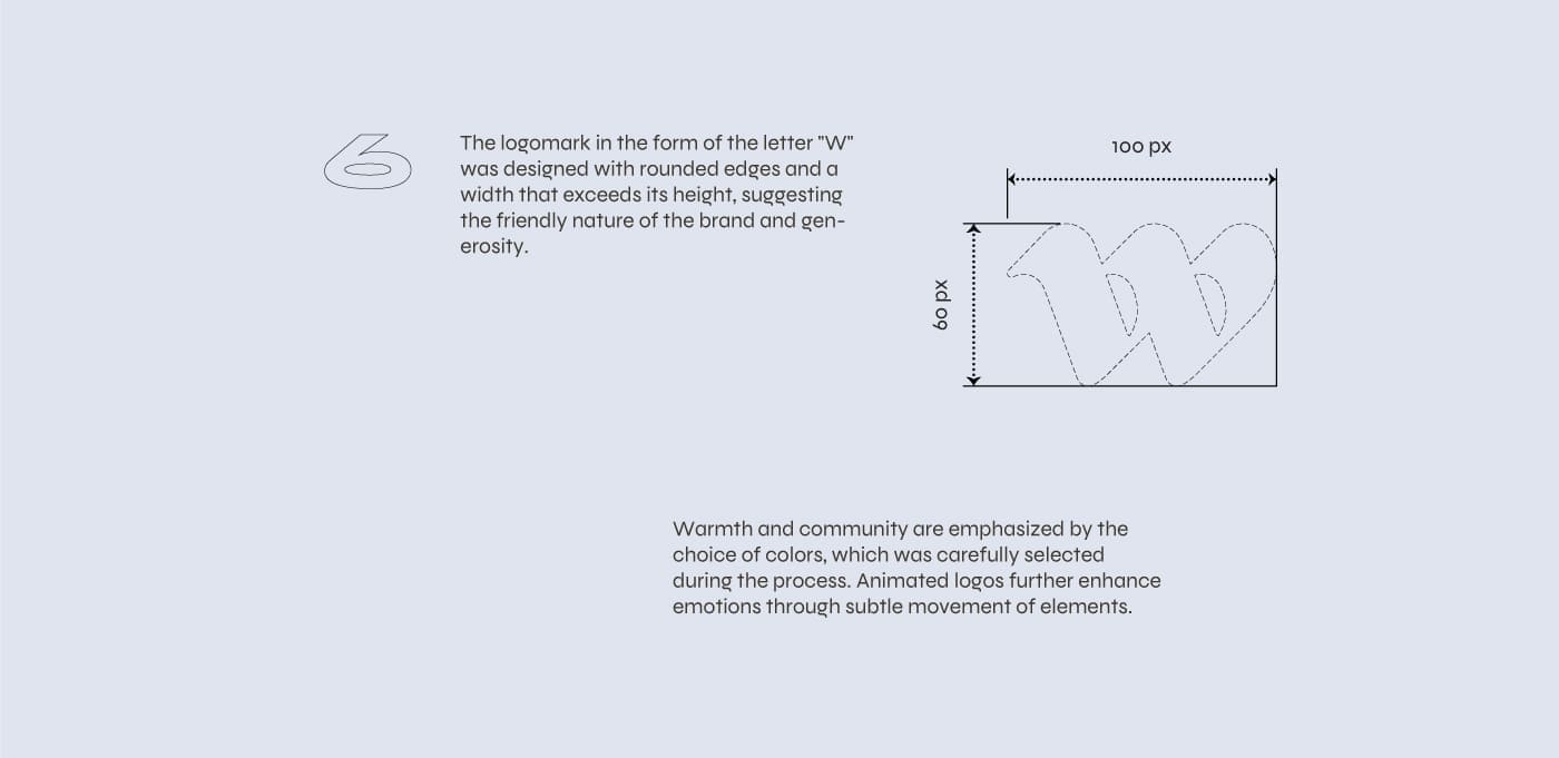
- It should evoke friendly associations and a sense of warmth and community.
- The logo should reflect the brand’s identity.
- It needs to be recognisable and clearly associated with the brand.
- The design must have a deeper meaning, visible through shapes, lines, and colours.
- It must be applicable in different media, both print and digital.
- The design should be timeless, with the aim of avoiding the need for a redesign in the upcoming years.
TYPOGRAPHY
The choice of typography was driven by the desire to highlight a modern and youthful style, while also retaining an element of seriousness. The font needed to reflect creativity and artistic expression. It was also important for the font to support the Cyrillic script. An additional, but not mandatory, requirement was that the font be suitable for web use.
The search began on Google Fonts, where I was fortunate to find a font that met all the specified criteria.
Font Syne
“Syne” is a geometric sans-serif font that stands out for its unusual combinations of weights and styles. Designed for the Art Centre “Synesthésie” in France, this font is characterised by its adaptability – it expands as it becomes bolder. Syne is free and open-source, making it ideal for a wide range of creative and practical applications in design.
COLORS
“Explore – Learn – Create” were the key words that served as the basis for exploring emotions related to these actions.
The sense of adventure and excitement is present throughout the exploration. Creativity and enthusiasm are tied to learning. Innovation and creating something new are part of the creation process.
This was the starting point for selecting colours that match the emotions the brand wants to evoke.
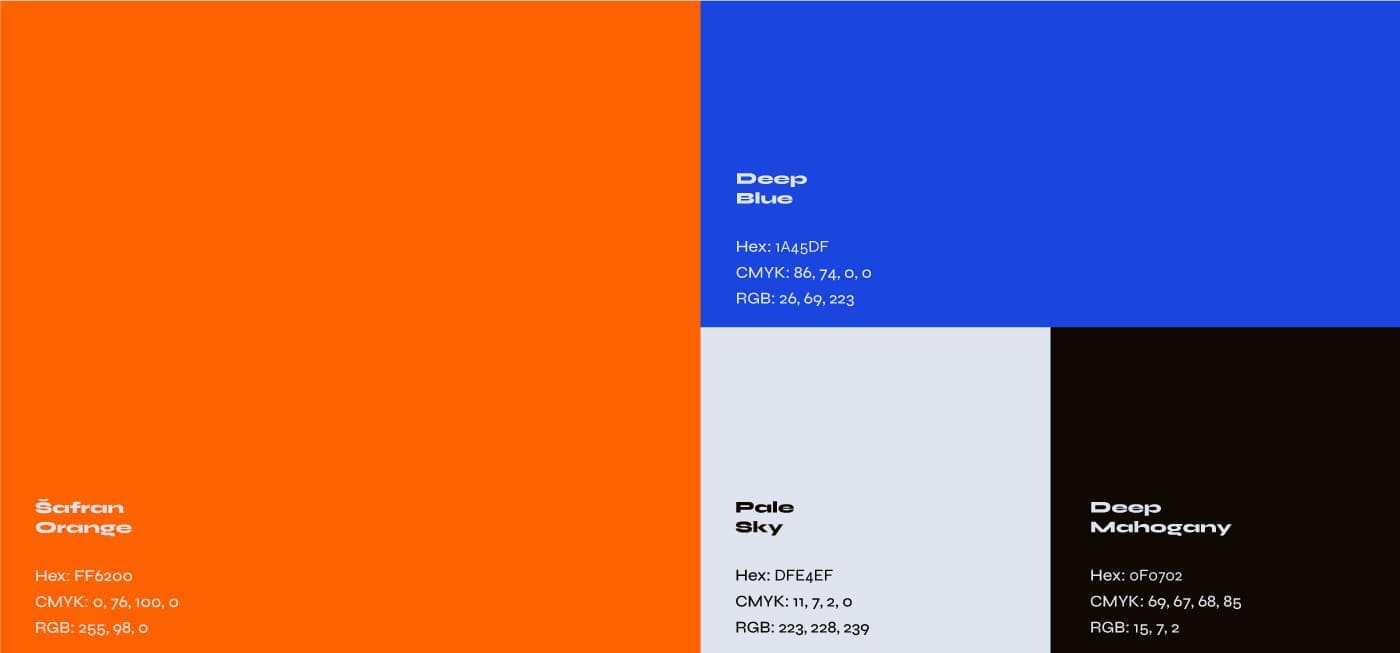
Each colour was given its own name to make its use more understandable.
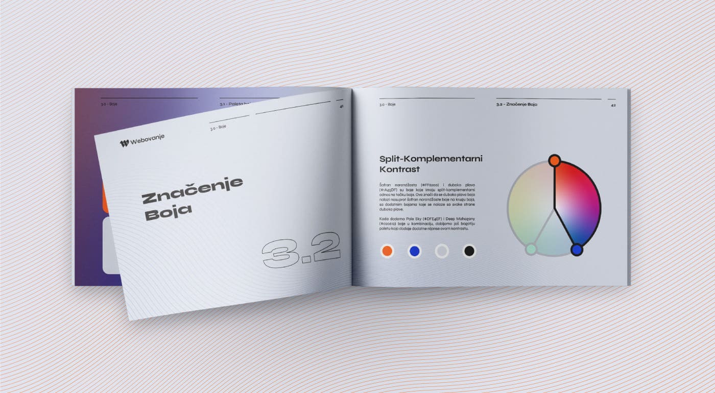
- Saffron Orange (#FF6200): Explore
This vibrant, energetic shade of orange symbolises adventure and excitement associated with exploration. Orange colour is often associated with enthusiasm and bravery, reflecting the spirit of exploration. - Deep Blue (#1A45DF): Learn
Dark blue can reflect depth and seriousness, in line with the learning process. This colour is often tied to stability, reliability, and wisdom, which are key elements in acquiring knowledge. - Pale Sky (#DFE4EF): Create
This light blue, almost sky-like shade, symbolises the endless possibilities and openness, essential for innovation and creating something new. This colour is often associated with inspiration and calmness, creating an ideal environment for the creative process. - Deep Mahogany (#0F0702):
In the context of exploration, learning, and creating, this colour can represent thoroughness and solidity, providing stability and focus in the process.
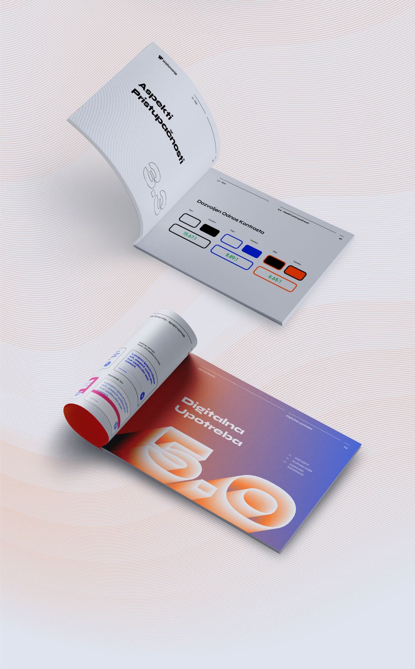
When selecting colours, special attention was paid to their contrasting harmony, which had to meet standard norms. For this reason, combining colours such as Saffron Orange with Deep Mahogany, and Deep Blue with Pale Sky was approved. In certain circumstances, combining Saffron Orange and Deep Blue is also acceptable, especially in the context of background elements and similar applications.
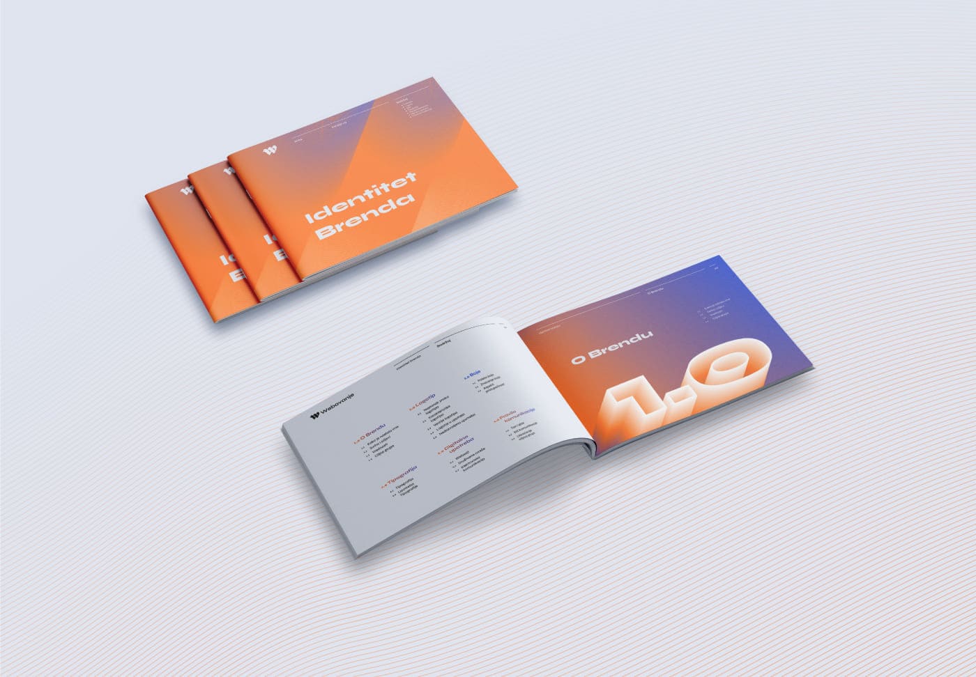
BRAND STANDARDS MANUAL
This document is not just a summary of previous work but a thoroughly structured guide that brings together key elements of the brand’s identity, ensuring its consistency and recognizability at all levels of communication.
Ready to Elevate Your Project?
Are you inspired to embark on a journey that transforms your vision into reality? Book a call with me, and let’s explore how we can bring your project to life with the same precision, creativity, and attention to detail that Webovanje exemplifies. Together, we will create something extraordinary.