STANKO — Brand Rebranding for a Master Auto Painter

Industry
Automotive Bodywork & Paint
Client
Stanko Autofarbar-Autolimar
Service
Rebranding, Brand Identity, Logo Design
Date
March 2026
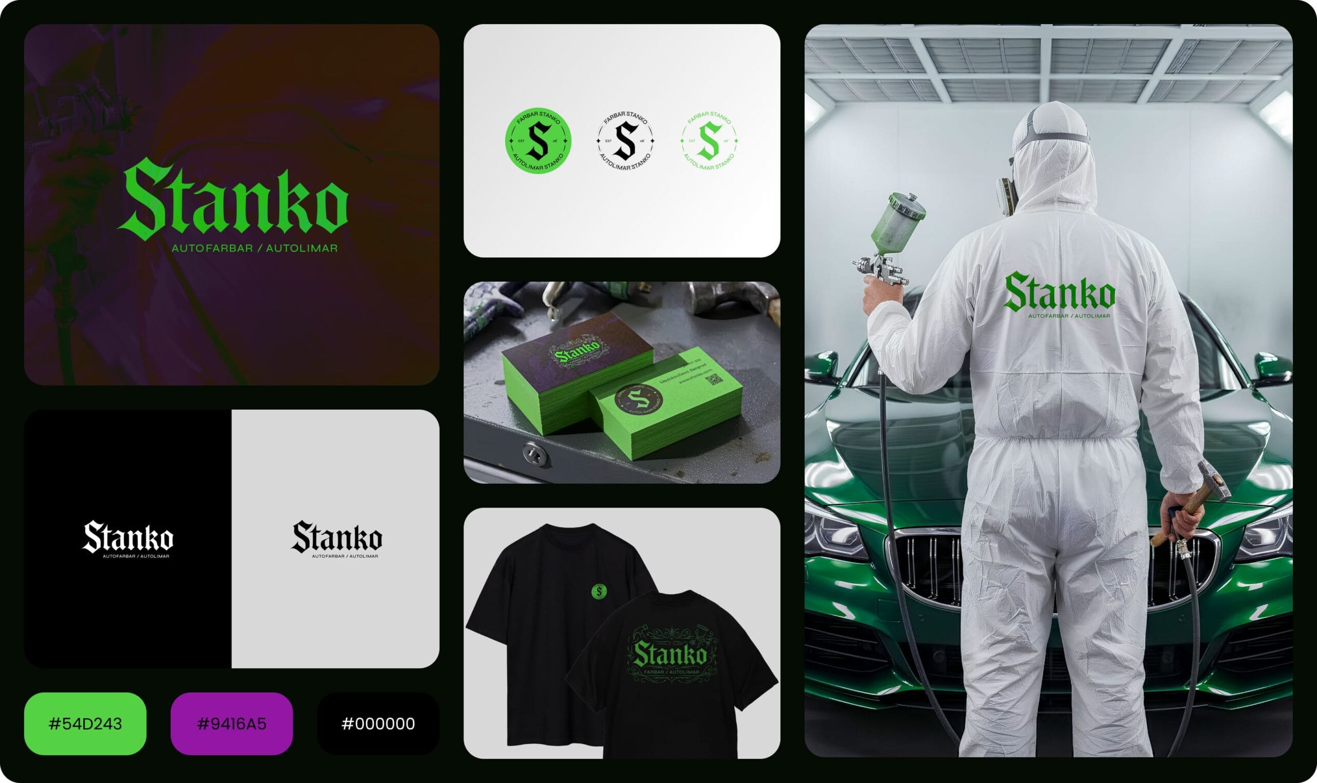
Category: Rebranding / Logo Design Industry: Automotive Bodywork & Paint
Before → After
Before: a vintage-style badge — a hot rod illustration inside a distressed leather patch, with “AUTO-LIMAR STANKO, Established ’08” arched around it. Warm, nostalgic, garage-workshop feel — the kind of mark that blends in with countless other automotive shops running the same retro-badge formula.
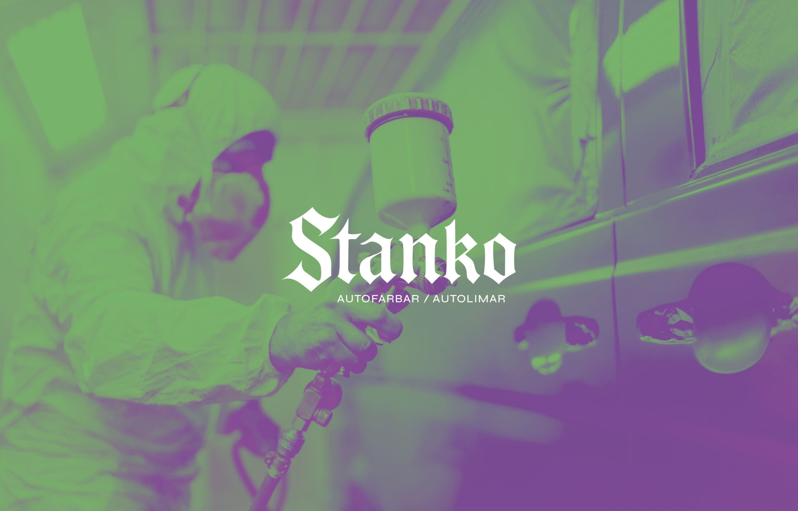
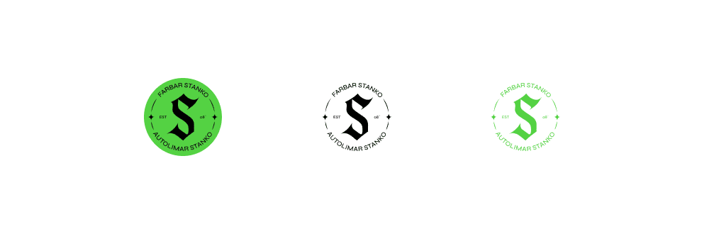
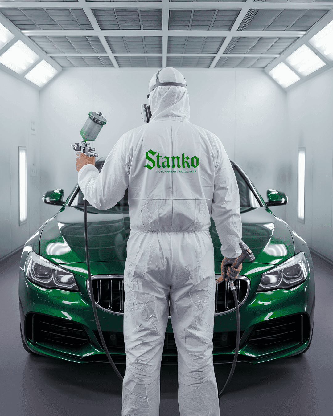
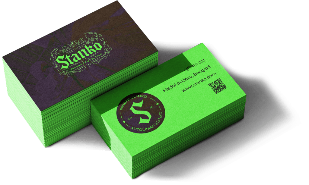
After: a custom blackletter wordmark, stripped of illustration, built entirely on typographic weight and contrast. No car icon, no badge shape, no vintage texture — just a name, carried by a typeface strong enough to stand on its own.
This wasn’t a simple visual refresh. It was a full repositioning: from a friendly neighborhood garage look to a mark with real authority — one that signals STANKO no longer competes on being liked, but on being unmistakable.
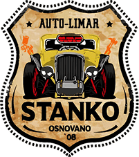
Stanko Logo – BEFORE

Stanko Logo – AFTER
Why This Logo?
The STANKO brand wasn’t built to fit in. It was built to be remembered.
In an industry where most craft and mechanic brands lean on the same tired templates, STANKO’s logo deliberately breaks expectations. It doesn’t look “the way it’s supposed to” — because its owner isn’t like the rest.


The Psychology of Mismatch
When people see something that doesn’t belong to its category, the brain hesitates. It registers a small “glitch in the system” — and that glitch triggers a spike of curiosity. What is this logo actually doing?
It fuses blackletter gothic type — historically serious, structurally solid — with the trade of an auto painter. The result is a paradox: can a guy who repairs dents and sprays paint really carry an identity this strong? That paradox is exactly where the story begins: who is STANKO?
Visual Language
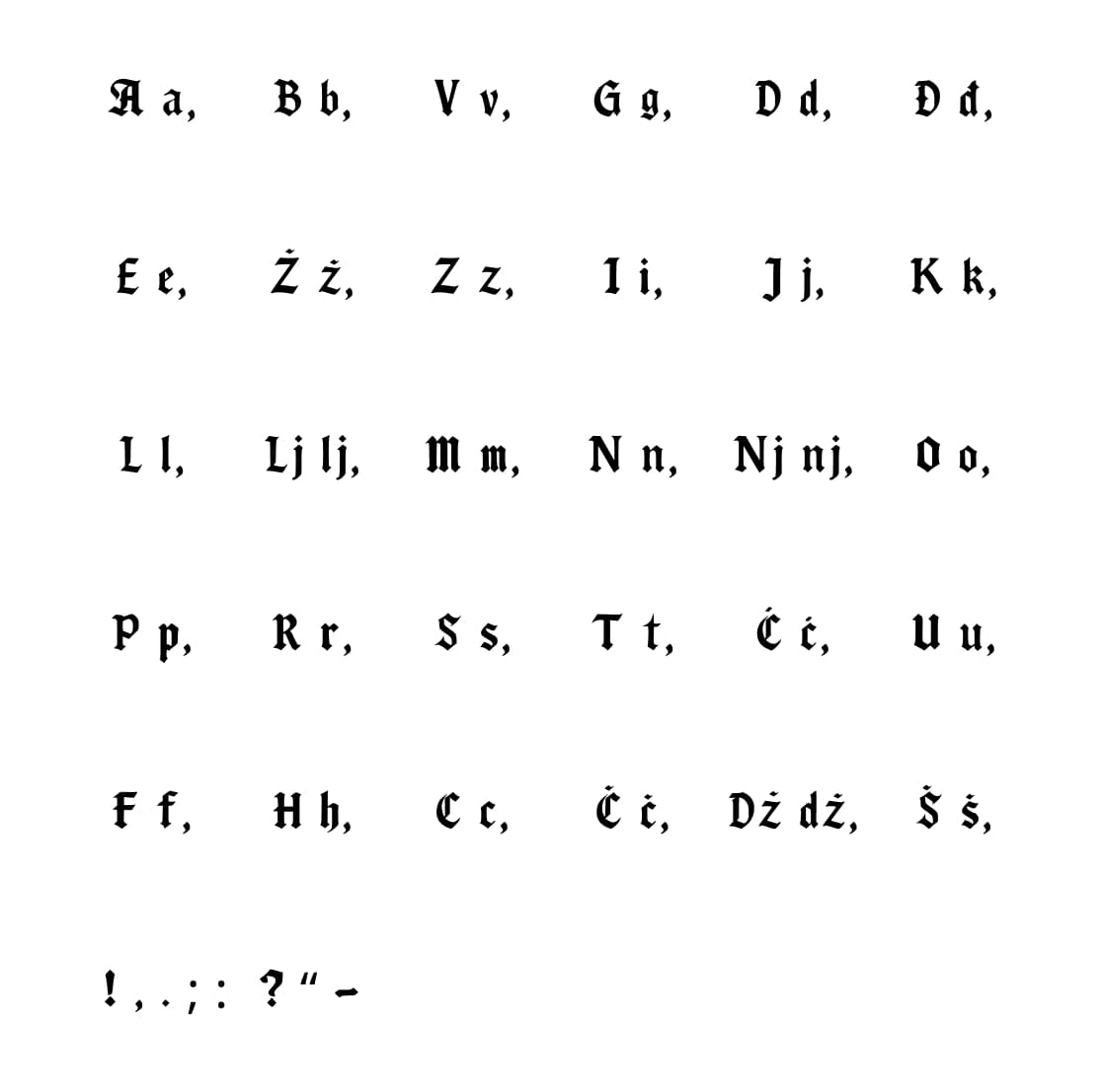
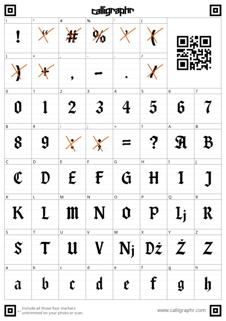
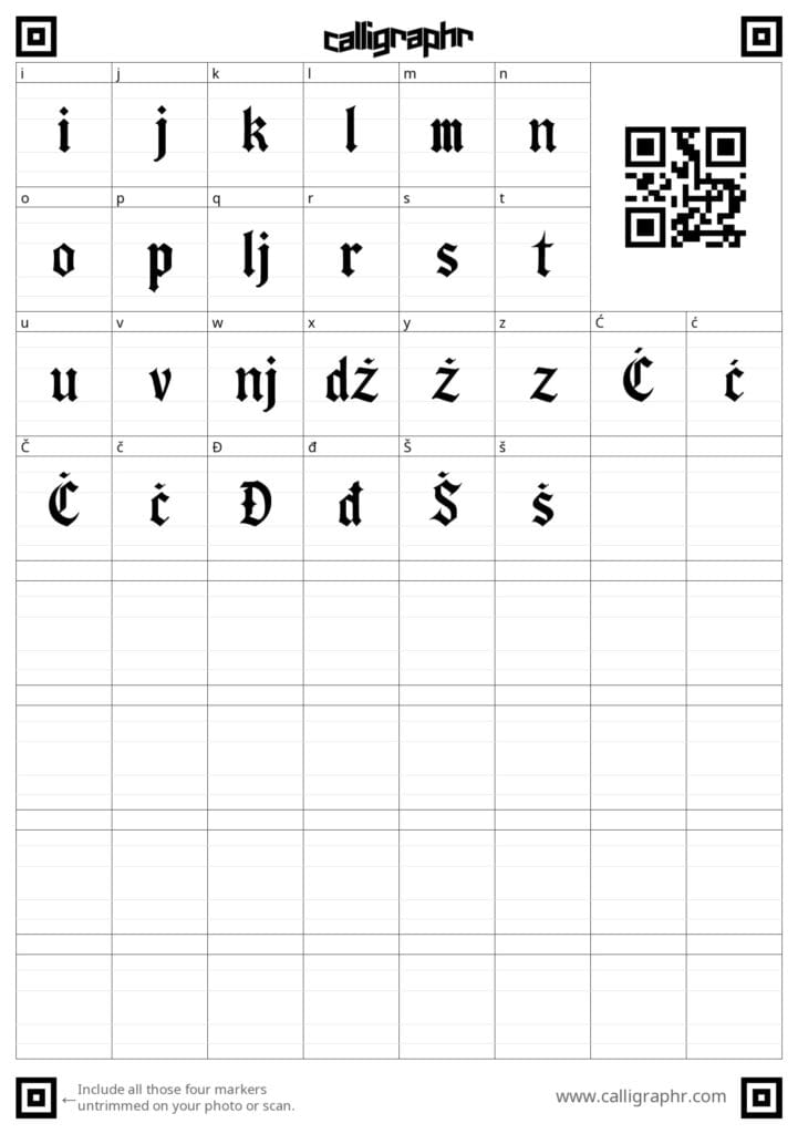
Typography — Custom Blackletter
- Sharp, solid letterforms signal precision in the work itself.
- The blackletter style carries craft-weight and visual authority.
- It sends one message: this is serious business, no shortcuts here.
- The serif character gives it timelessness — like the stamp of an old-world master.
Supporting Typeface — Syne
- Modern, neutral, functional.
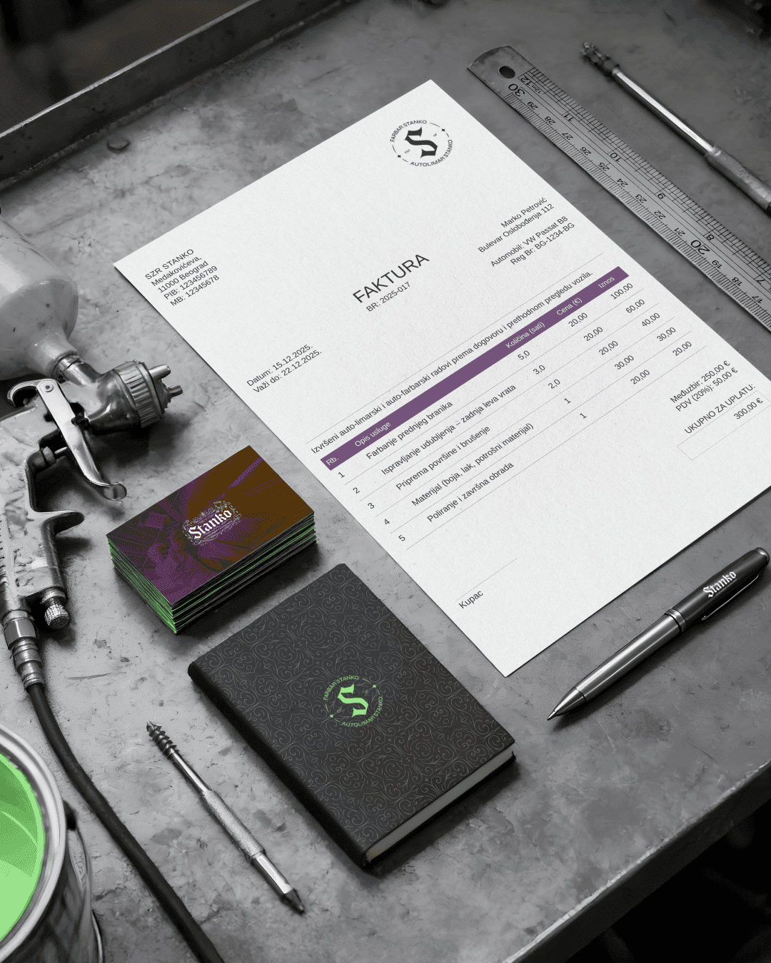
- Clearly communicates what STANKO actually does: AUTOFARBAR / AUTOLIMAR (auto painter / auto body repair).
- The pairing of the two typefaces sharpens the contrast between artistic identity and craft clarity.
Color Palette
Primary
- Green
#54D243— energy, youth, freshness - Black
#000000— seriousness, strength, consistency - White
#FFFFFF— clarity, balance
Accent
- Purple
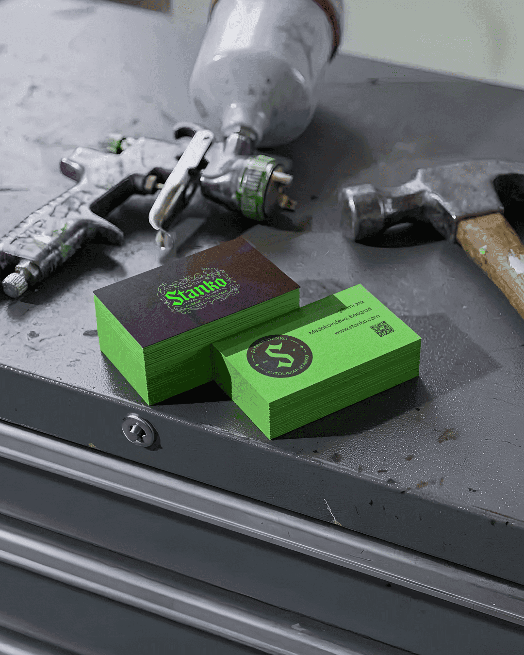
#9416A5(Difference blend mode) — a visual distortion of the system. The artistic element. Represents unpredictability, individuality, attitude.
Together, these colors lift the brand above the industry average and set it apart on both a visual and emotional level.

Cultural DNA: Street Culture × Craft Honor
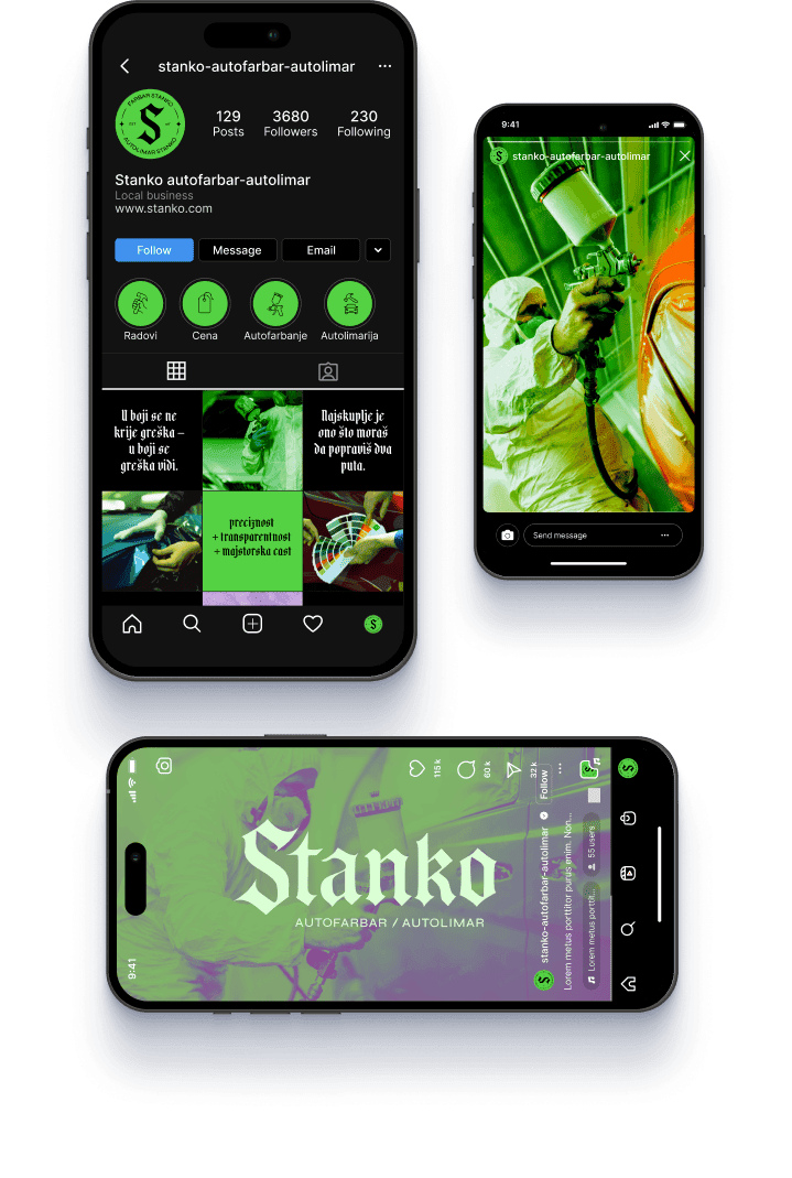
The logo carries the spirit of graffiti, hip-hop, and street aesthetics — honest, raw, unafraid. At the same time, it speaks through the discipline of classic typographic form.
That’s STANKO in a sentence:
- Playful, witty, spontaneous
- But with a hand that doesn’t make mistakes
- And an attitude that backs down from no other tradesman
An Identity That Has to Be Earned
An identity this strong can only survive if the man behind it deserves it. STANKO:
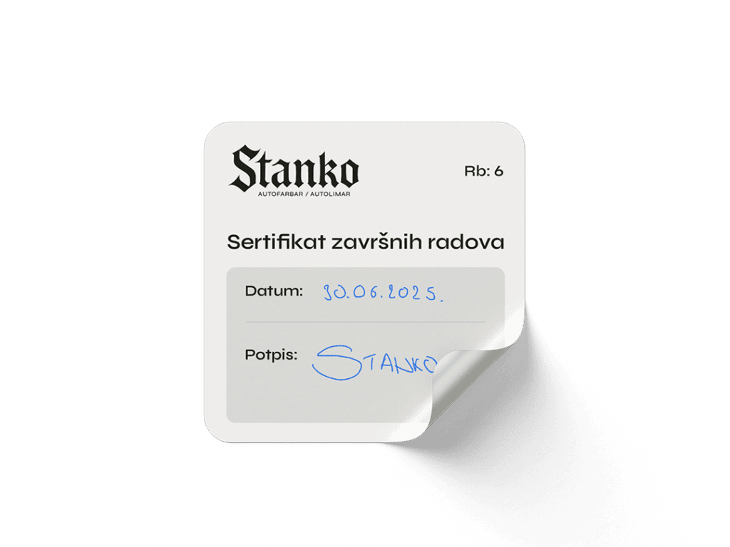
- Signs every job he completes — not out of vanity, but out of accountability for quality.
- Issues a completion certificate for finished work, because he knows his name stands behind every car.
- Shares his knowledge openly — because a true master isn’t measured by what he hides, but by what he leaves behind.

The Repositioning Goal
STANKO isn’t trying to lose his existing customers. He wants to stay accessible — while making the value of his work unmistakable.
The old badge logo spoke the same visual language as every other garage on the block. The new one refuses to. It’s the first signal of a new message to the market:
“This is no longer the guy you go to for the cheapest job — he’s the one you go to when you need the best.”
Who does this identity speak to?
- People who know the trade — they’ll recognize the symbolism and the seriousness.
- Clients who want peace of mind — they’ll feel the stability built into the presentation.
- Dealerships that need precision — they’ll see the system, the order, the character.
STANKO is a bold, functional, and authentic blend of:
- Street art aesthetics
- Craft honor
- Psychological differentiation
- A precise visual system
This isn’t a “pretty” logo. It’s a statement — of character, knowledge, and attitude.
Brand Foundation
Mission
Through dedication to the craft and quality without compromise, Stanko leaves a mark — not just on cars, but on what it means to be a real master. Every client, no matter the car, knows they’ve received work worthy of the name behind it.
Vision
To become a reference point in the auto-painting industry in Belgrade and beyond — a reputation that spreads through the work itself, not through marketing, but through word of mouth. To be the choice of clients who want certainty, and of dealerships that demand precision.
Values
| Value | Meaning |
|---|---|
| Craft Honor | Hand and word must be equally clean. If I wouldn’t do it this way for myself, I won’t do it for anyone else. |
| Mastery in Motion | Respect for what’s been learned, paired with constant improvement. Stanko teaches others today, but never stops learning himself. |
| Honesty | No false representation. No overselling. If it’s done right, it will show. |
| Precision | Every edge, every line, every coat of paint — no improvising. |
| Respect for the Client | Whether it’s a Fiat Punto or a Porsche, at Stanko’s shop a car isn’t judged by its price tag, but by the attitude of its owner. |
Purpose
To pass knowledge and character on through the work itself. To bring auto painting back to being a named craft — not a faceless, fast-turnaround service.
Tone of Voice
Calm. Grounded. Reliable. With soul.
Speaks like someone who knows exactly what he’s doing — and doesn’t need to prove it.
- Craft-rooted: proper terminology, respect for process
- Street-honest: authentic, unpretentious
- Trustworthy: not philosophizing — just what’s actually worth saying
Brand Voice in Practice
Instead of a conventional slogan, Stanko’s message lives as a feeling the client carries with them:
- “Your car’s at Stanko’s? Then you already know it’ll be done right.”
- “If he signed it, you don’t need to look twice.”
- “This isn’t an ad. This is a guarantee.”
Ready to Elevate Your Project?
Are you inspired to embark on a journey that transforms your vision into reality? Book a call with me, and let’s explore how we can bring your project to life with the same precision, creativity, and attention to detail that project Stanko exemplifies. Together, we will create something extraordinary.