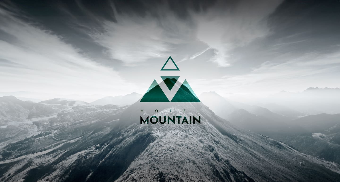
Hotel Mountain – Brand Development
Industry
Hospitality
Client
Hotel Mountain
Service
Brand Identity, Target Group, Logo Design, Web Design
Date
October 2023
Hotel Mountain brand development represents a pinnacle in conceptual design, marrying the precision of architectural innovation with the nuanced art of branding. This project aimed to create a comprehensive identity for a hotel that caters exclusively to the upper echelons of the business world—businessmen and CEOs seeking a blend of privacy, luxury, and seamless operational capacity for their professional activities.
Design Philosophy: At its core, Hotel Mountain is an embodiment of isolation, minimalism, and luxury.
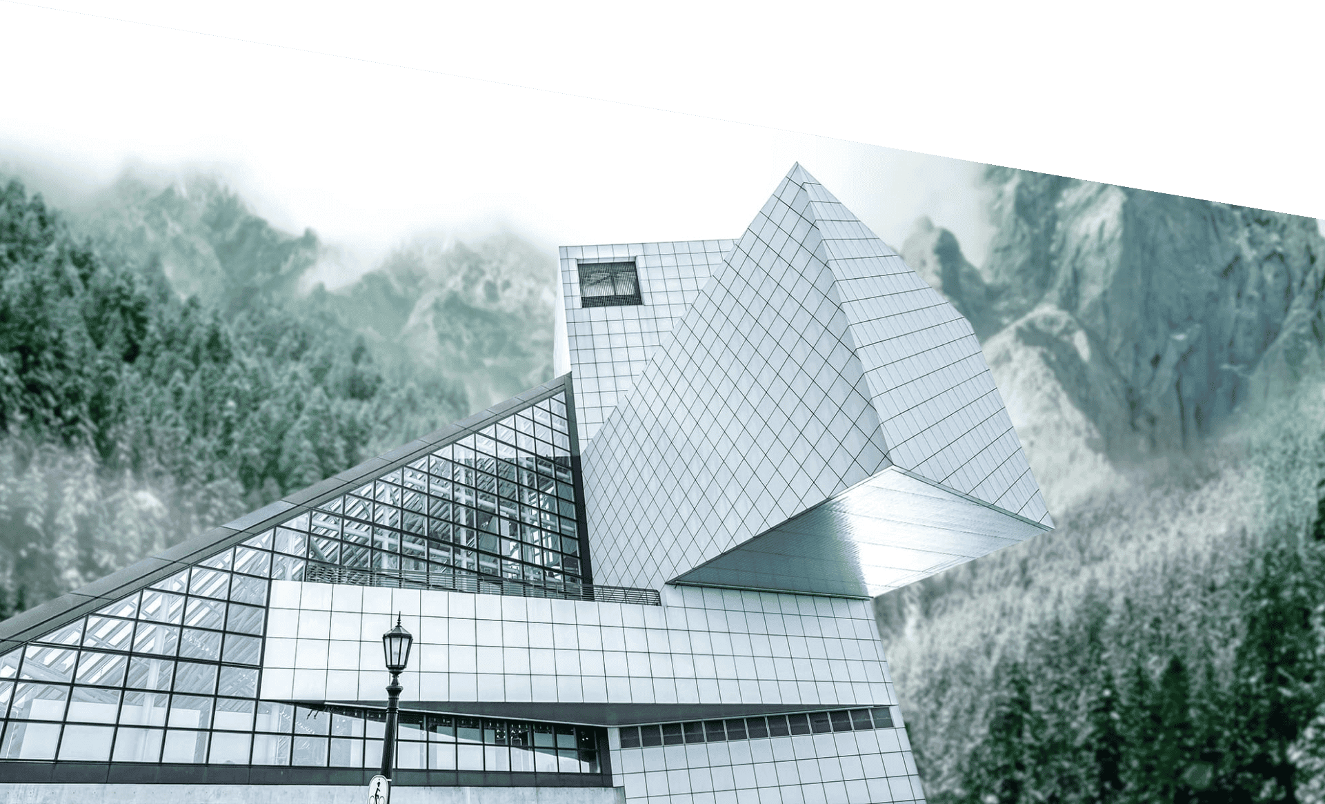
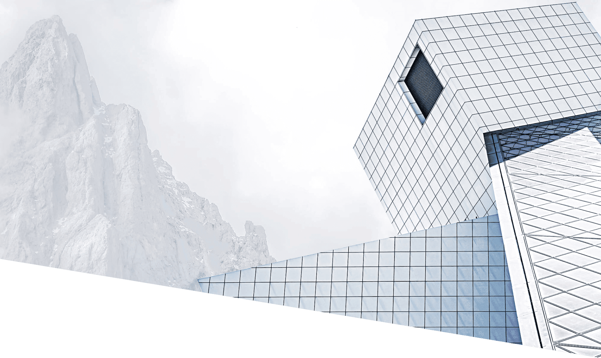
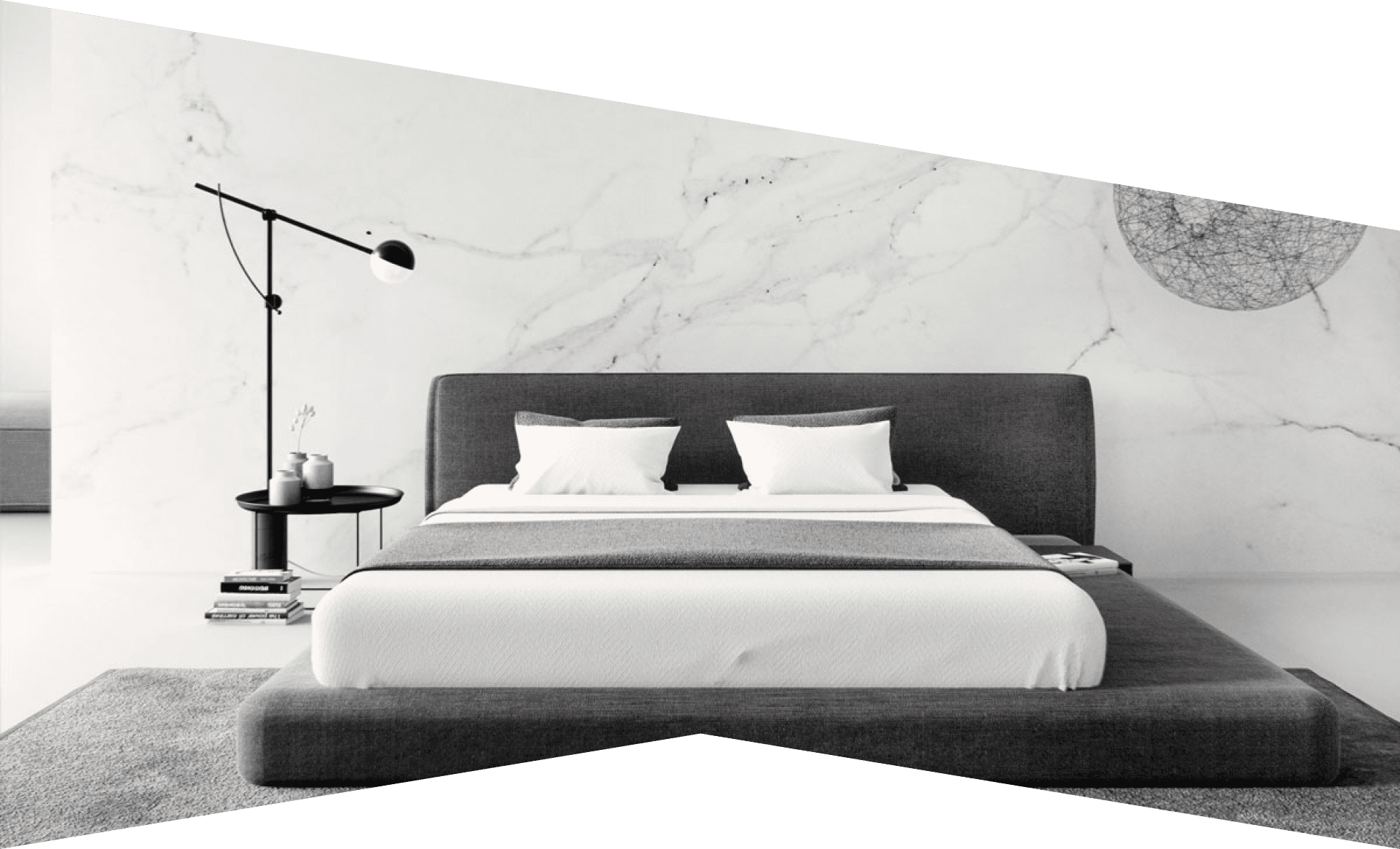
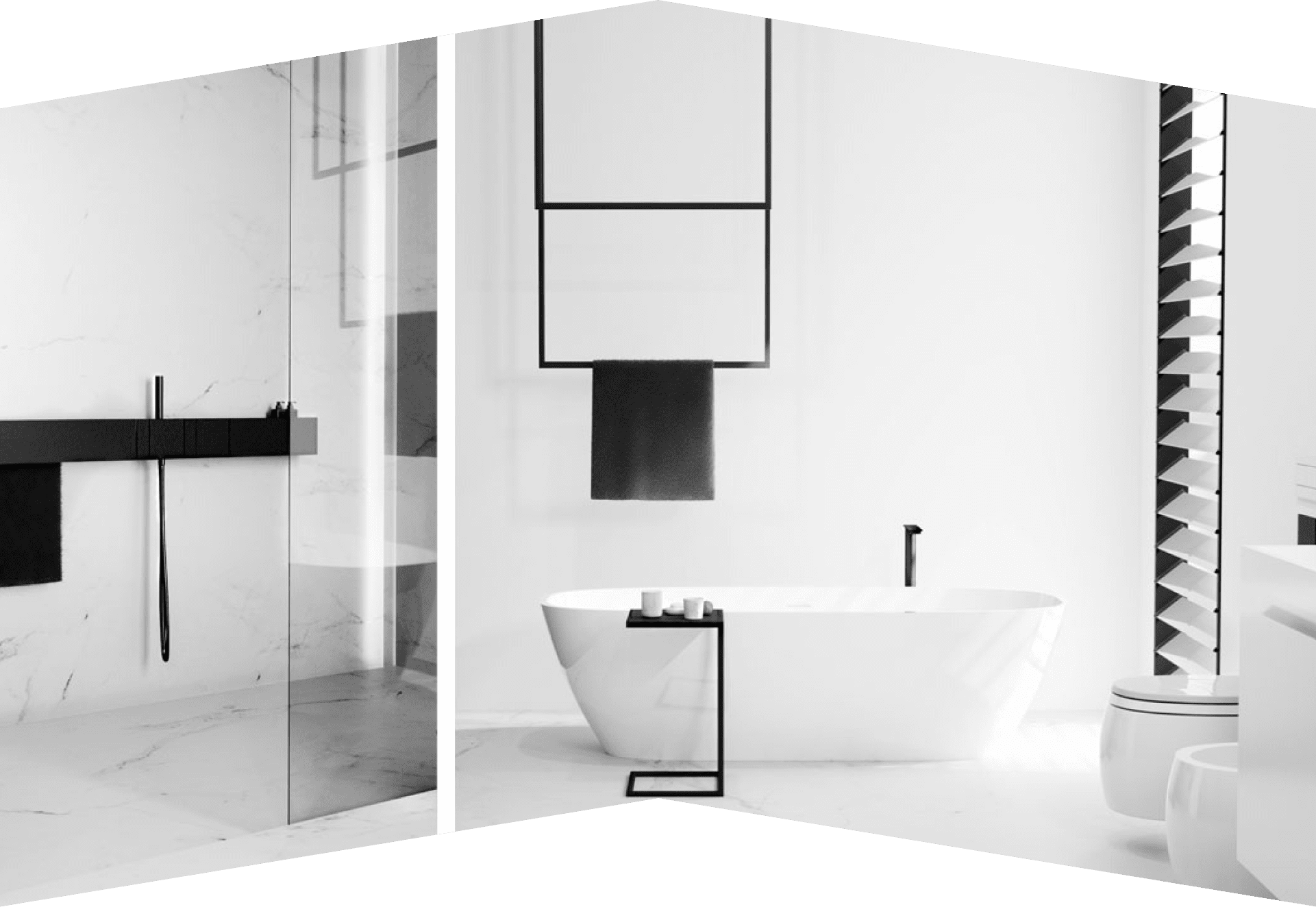
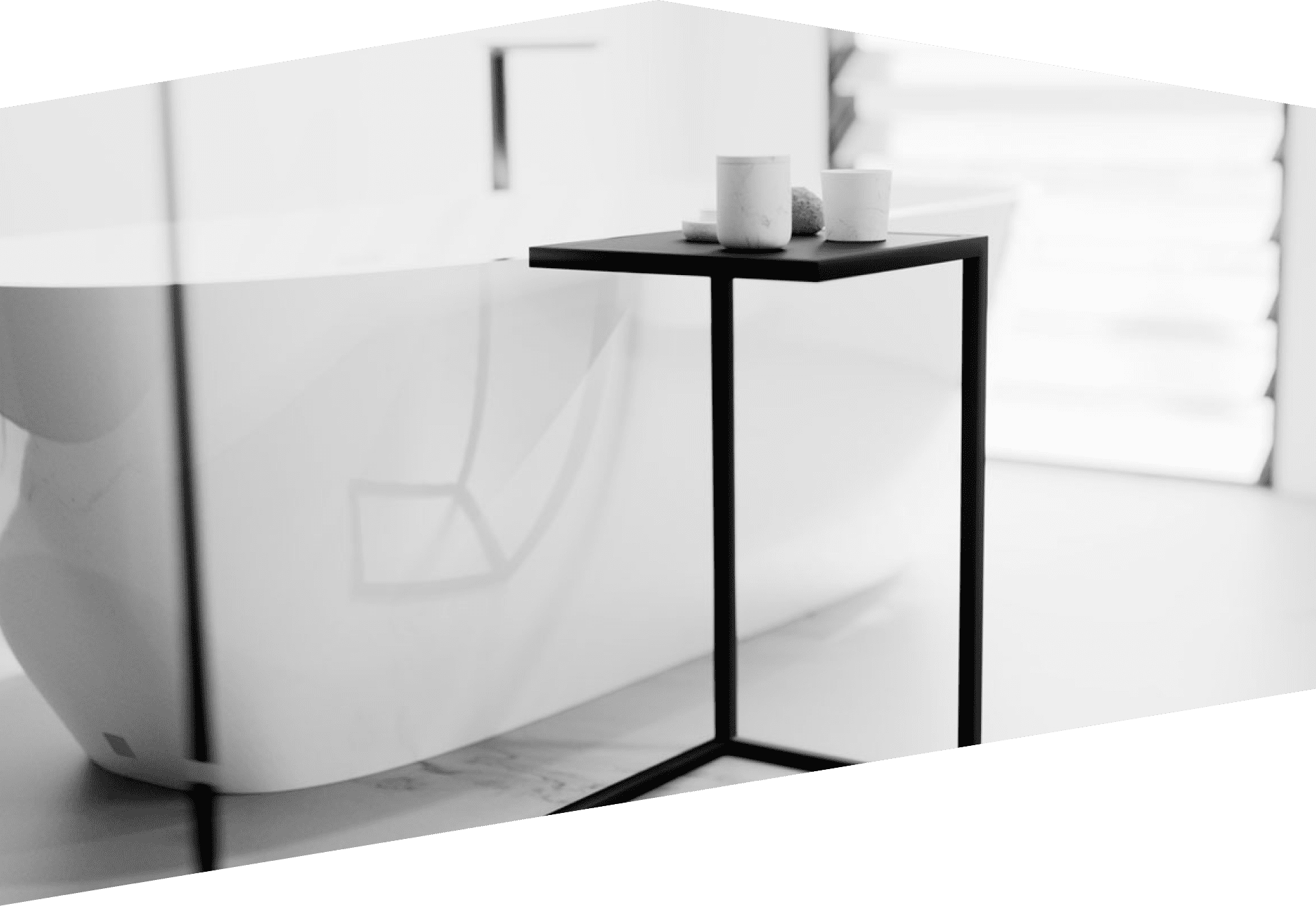
Hotel Interior and exterior
Hotel Mountain is based on the idea of an isolated, minimalist and luxury hotel. Equipped with the latest technology and great attention to comfort as well as visual harmony. Accommodation at the hotel is possible only with an invitation and an exclusive membership card with unique parameters generated on each arrival.
The exterior of the hotel has been designed so that even in the first encounter, it is clear that it is a minimalist building with accentuated corners. The sharp lines that cut through the harmonic surroundings of the mountain give a clear sign that this hotel is not meant for everyone.
The interior is a combination of metal, marble and wood, although cold metal and stone are dominant, the warmth of the wood maintains harmony and a pleasant atmosphere.
The similarity between the mountain and the hotel, which is used in the design process, is that the high mountain peaks are hard to conquer, and the reward is invaluable. The same effort is needed to earn a stay at the Mountain Hotel, and the privileged are maximally rewarded.
Logo
Three key questions were taken into the logo design:
- What is the name of the hotel?
- Where is his location?
- What does the hotel represent?
Symbolism and clarification of logo elements
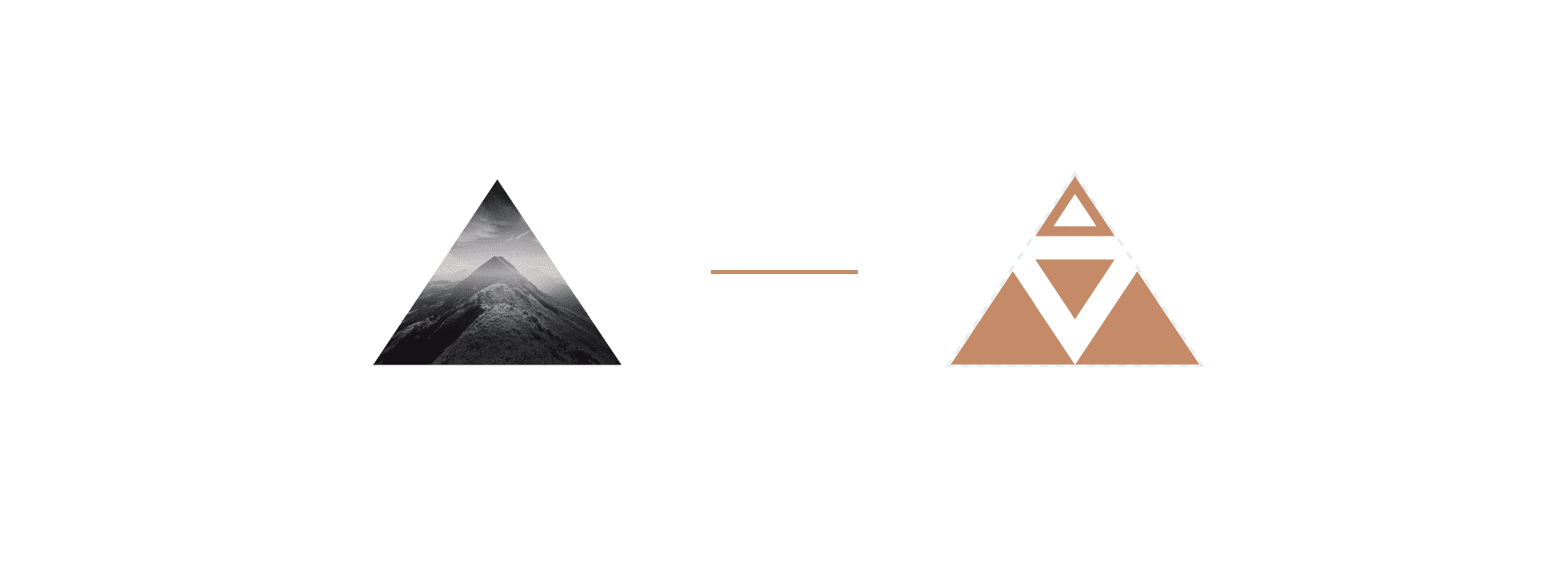
The triangle that represents the shape of the mountain was a logical geometric shape that serves as the basis of the logo.
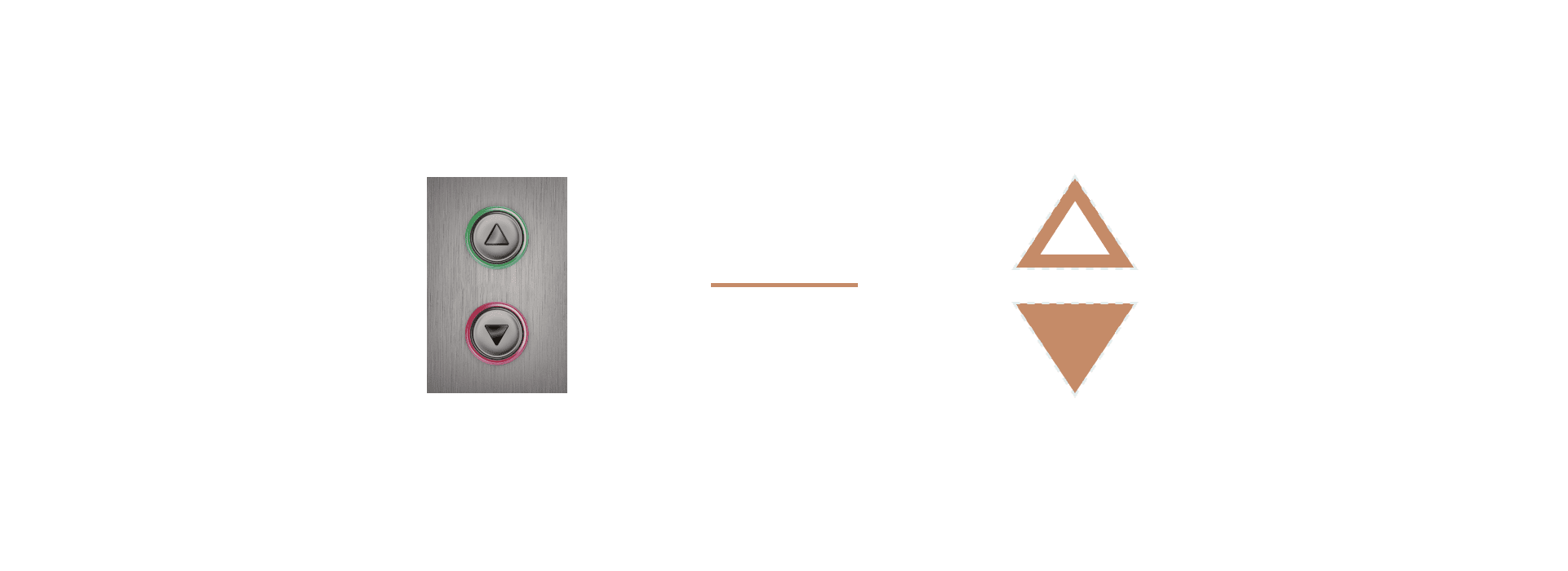
Elevator call buttons are an association for the ease of use, the accessibility is turned towards user experience. And the highlighted button “UP” symbolises progress.
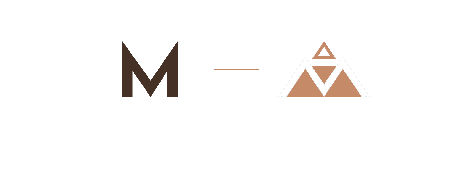
The initial letter M from the name Mountain has been given the role of merging the mountain and the hotel into one and is invisibly located in the very centre of the logo.
Example on opposite background colour.
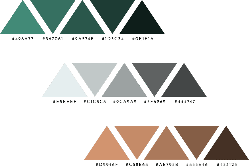
Colors
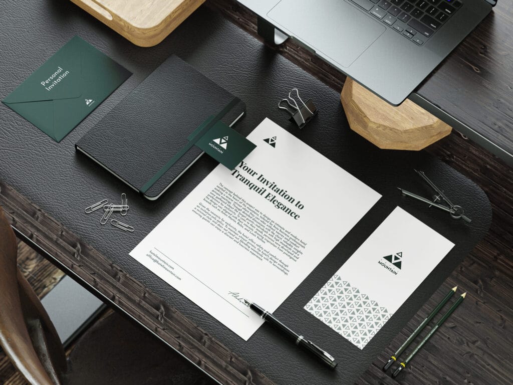
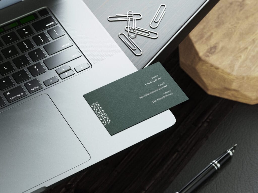
Colaterals
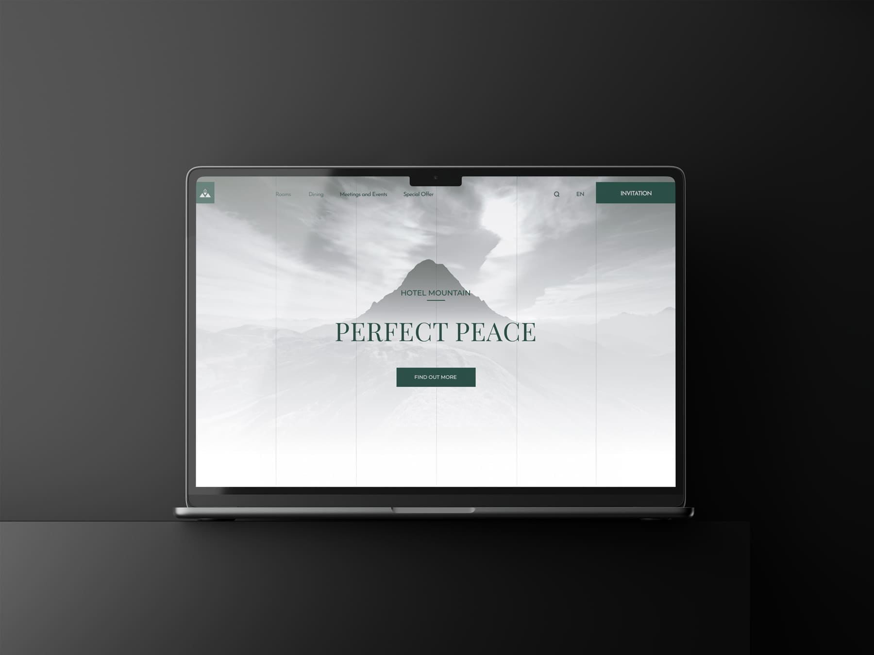
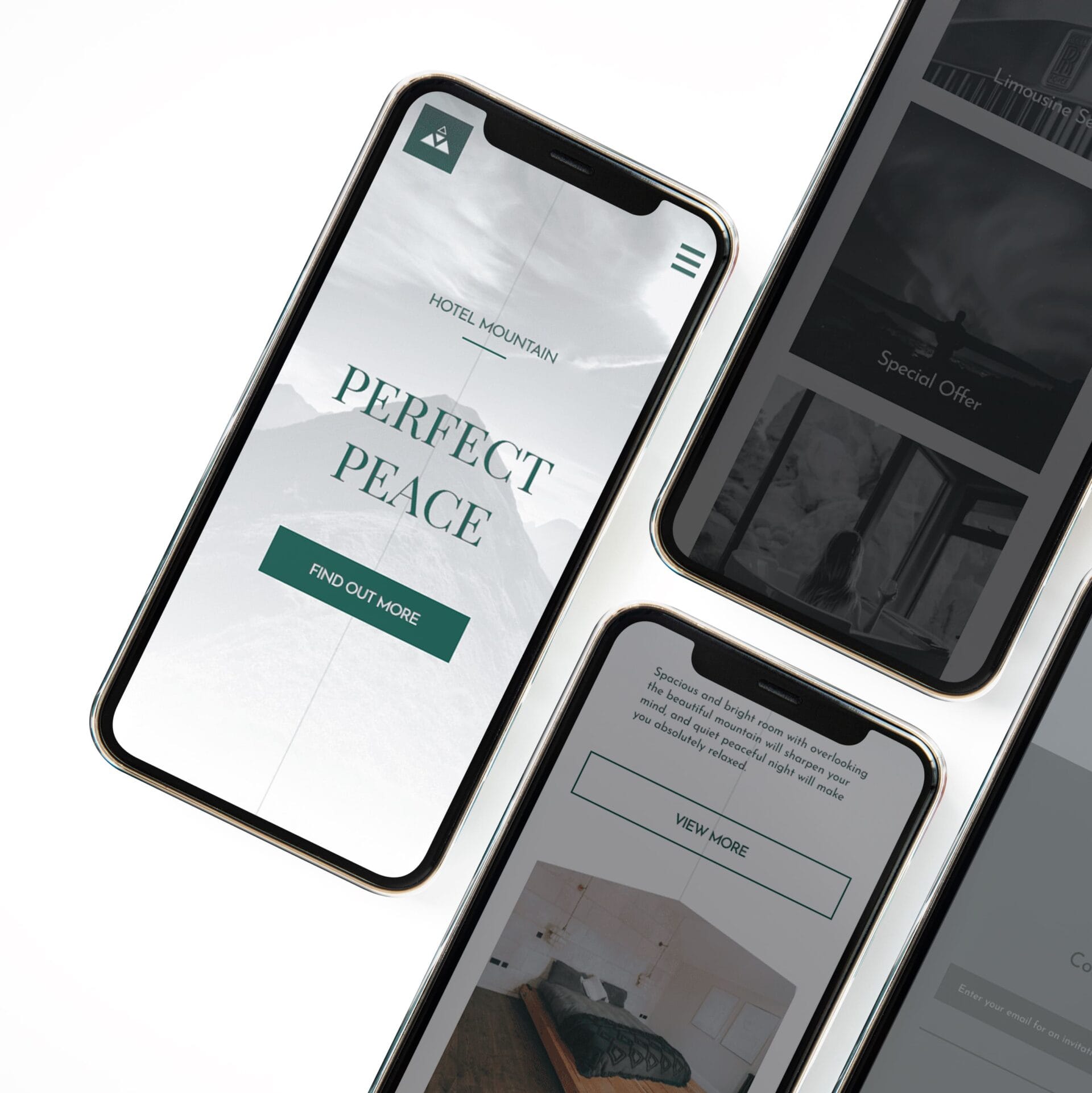
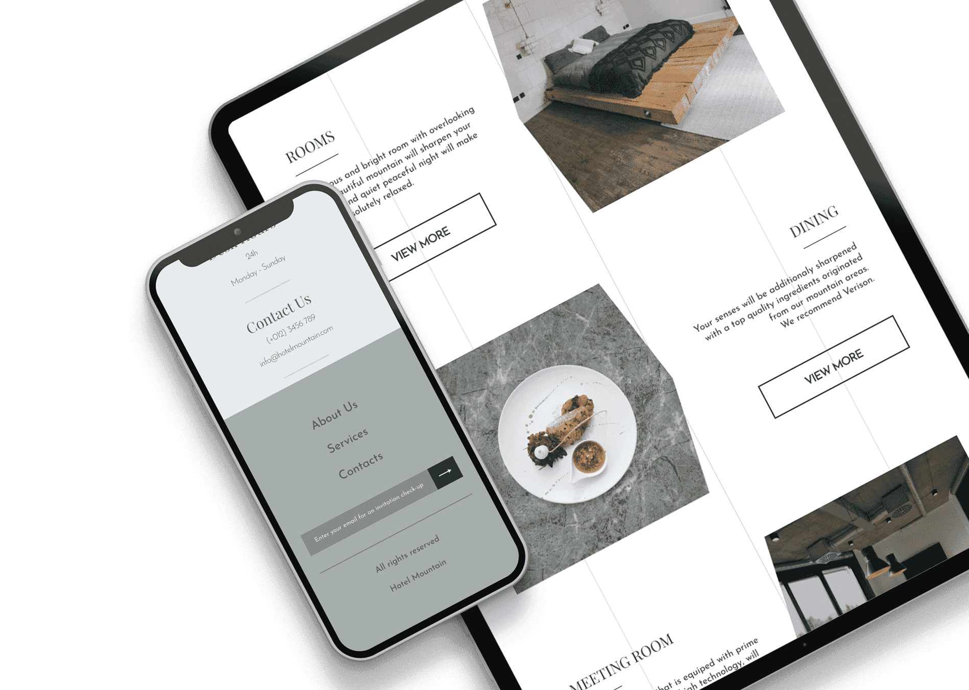
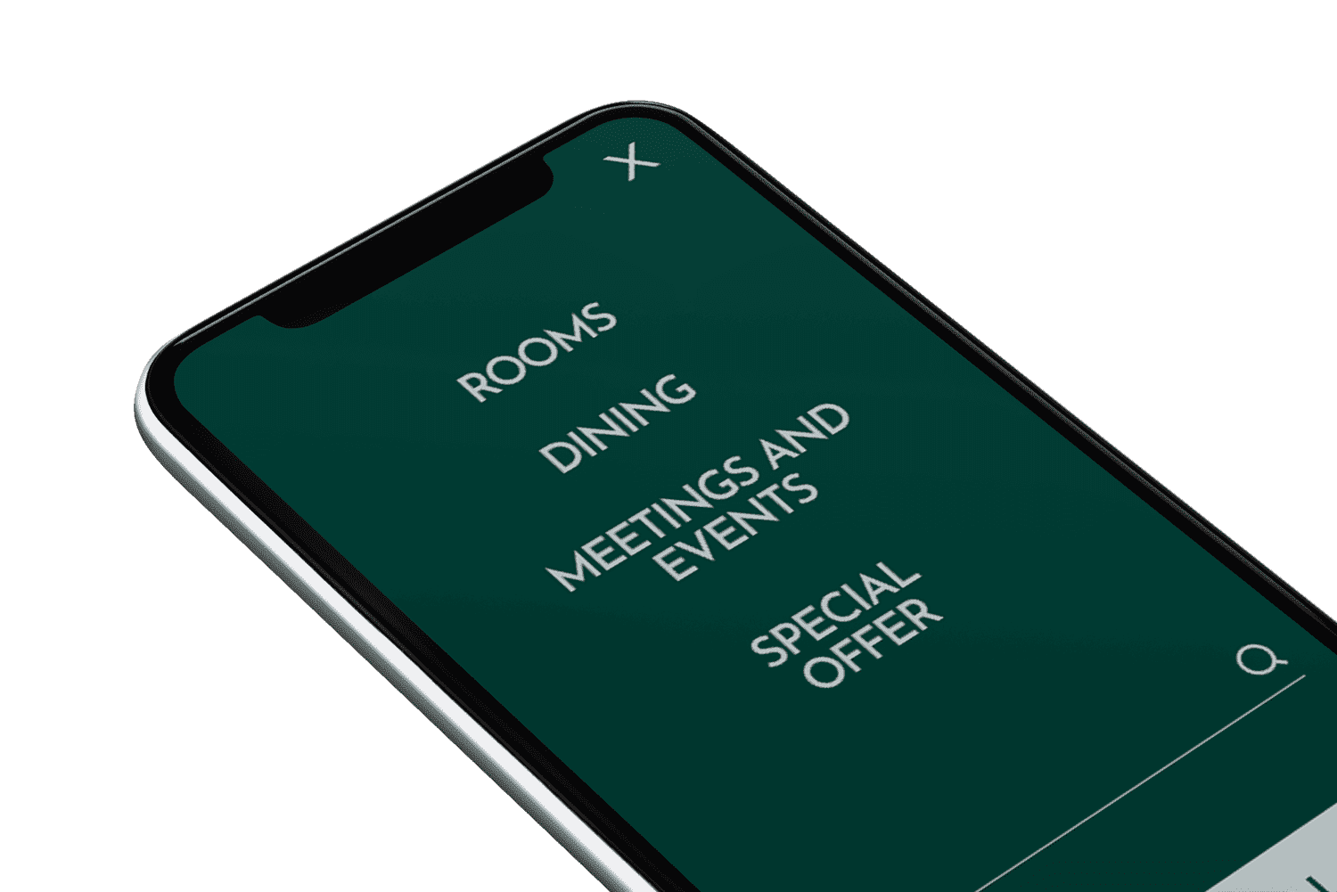
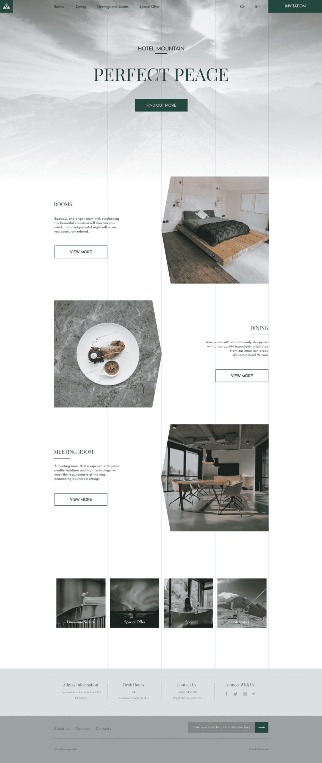
Website
Before entering the main site, it is necessary to enter the uniquely generated code. After entering, you have the opportunity to peek into the current offer designed for hotel visitors. You can customise the offer, add or remove what doesn’t suit you. One of the special requirements is that visitors can choose whether their stay will be anonymous or not. After selecting the package, you can confirm the reservation. The user interface mirrors the theme of the hotel. Exclusivity, brand colours and a minimalist look are retained.
Ready to Elevate Your Project?
Are you inspired to embark on a journey that transforms your vision into reality? Book a call with me, and let’s explore how we can bring your project to life with the same precision, creativity, and attention to detail that Hotel Mountain exemplifies. Together, we will create something extraordinary.